It’s finally done…
… And you should be aware that there’s about a million photos coming up.
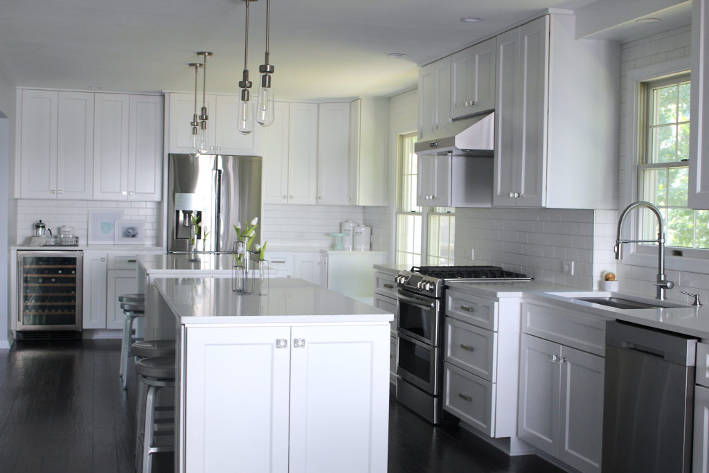
When I first started posting about our kitchen, I said it was going to be “modern industrial”. Since then, we’ve pretty much decorated the kitchen with everything farmhouse. Is there such thing as “modern industrial farmhouse”? Our kitchen is apparently having a identity crisis, but like my husband says, it’s what we like:) You can find the post about our design/inspiration here.
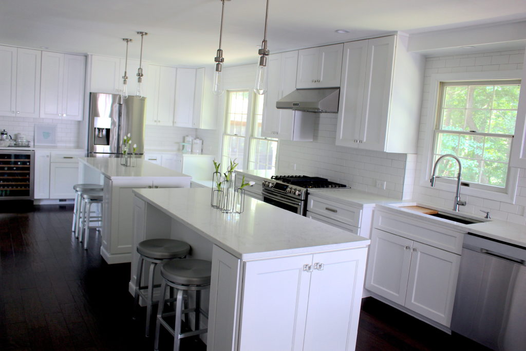
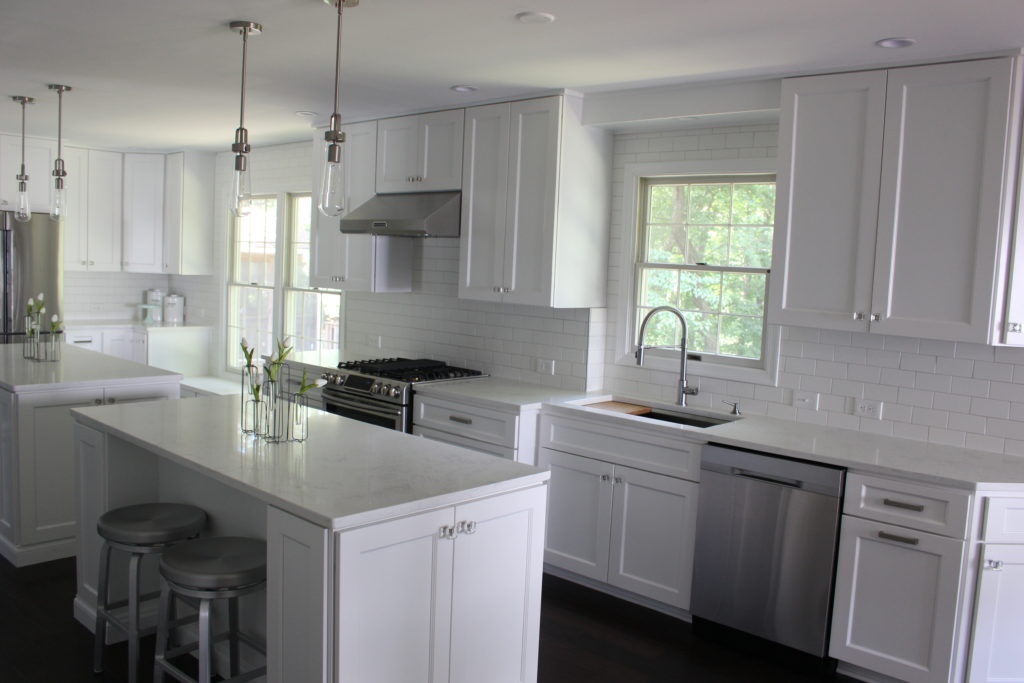
Just a reminder, we tore down the wall between the u-shaped kitchen and the dining room to make one big room. It’s long but narrow, so it was kind of a tough space to design. We know that the kitchen is where everyone likes to hang out. Our goal was to maximize storage and functionality while also leaving plenty of “hang out” room.
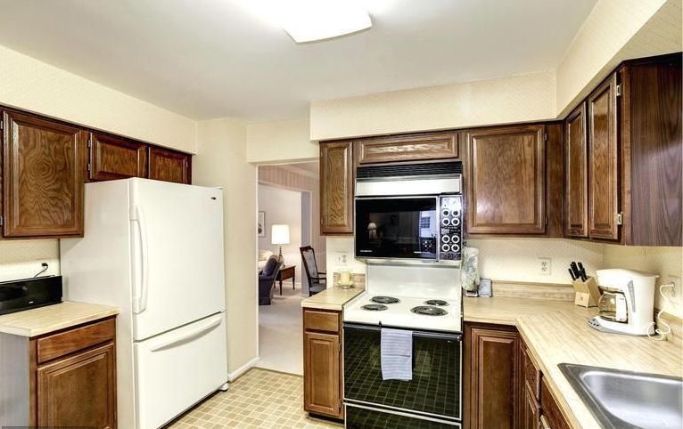
For reference, here’s the before picture:
Two Islands
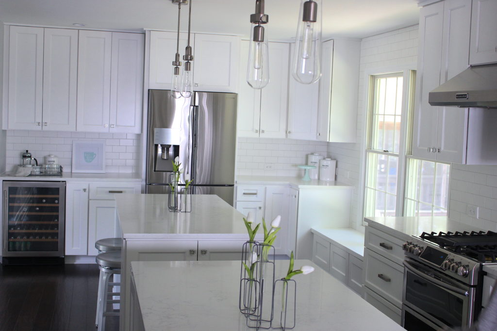
Long and narrow room meant long and narrow island. The stones we were looking at were about 10 to 10 1/2 feet long without a seam, but we really felt that you needed at least 12 ft of island to better fill the space. We debated doing a butcher block extension on one end, or doing a multi-level island, but we never fell in love with either of those ideas.
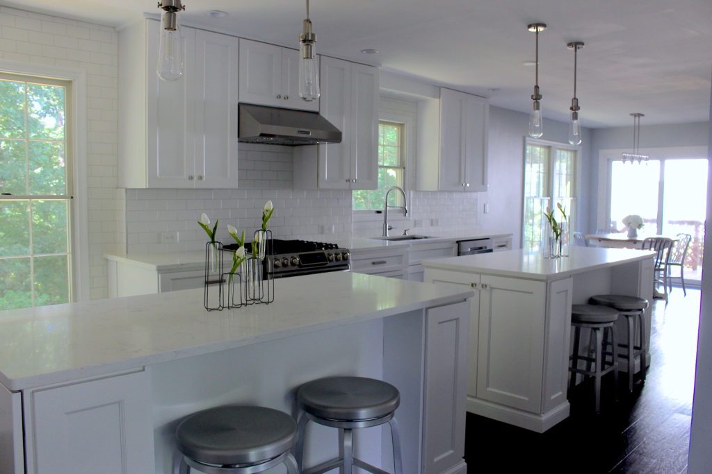
I also didn’t want to have to run around 12 ft of stone if one of my kids was about to fall off a bar stool… I can’t tell you how many times I watched spills happen in slow motion when we were in the apartment because I could never run around the 9 foot peninsula fast enough. That’s how we ended up with two islands. I really didn’t like the idea at first, but now I’m obsessed.
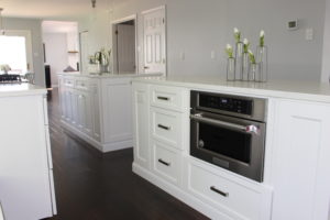
It’s amazing having so much counter space while also being able to move around easily. We haven’t really done any hosting yet, but I’m imagining one island to display food and one island for me to still use for prep or extra seating. I’m also very much in love with the wire flower vases we have decorating each island. They’re from my favorite…. Magnolia Market (link here).
Sidenote… the big blank wall behind the islands in the above photo wasn’t supposed to be there. We found out, too late, that we weren’t able to remove even a little of that wall because of duct work. VERY disappointing, but we’re working on finding a way to decorate it… Stay tuned!
A Big Sink
Apron-front sinks seem to be all the rage right now. I absolutely love them, and it’s what we were planning on doing for our kitchen from the beginning. I don’t know exactly what shifted, but Joe all of a sudden started talking about his “dream sink”…. ironic since he barely uses it;) I almost didn’t bother checking it out. I clearly held sink veto power, so why bother? Well, props to Joe, this sink is AWESOME. (link here)
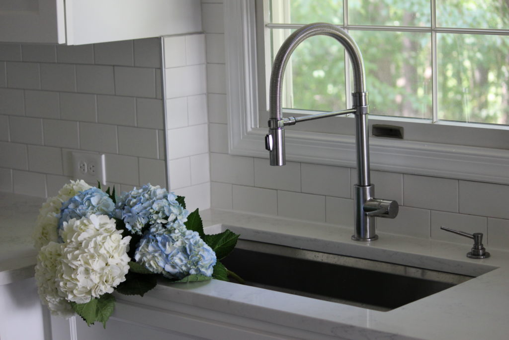
It comes with a bunch of accessories… cutting board, strainer, wash basin, and two drying racks. You can literally do so much prep work right in the sink, without getting water all over the countertops!

I keep one of the drying racks in there at all times. It’s where I keep the stuff I wash and reuse multiple times a day. Easy access, and it still leaves me with plenty of sink room. I love it so much, I don’t even miss the apron-front:)

Beverage Center
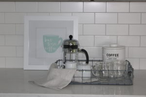
We added a wine fridge near the refrigerator, and we’ve organized that portion of the kitchen as the beverage center. All our glasses, mugs, coffee makers, etc. are over there.
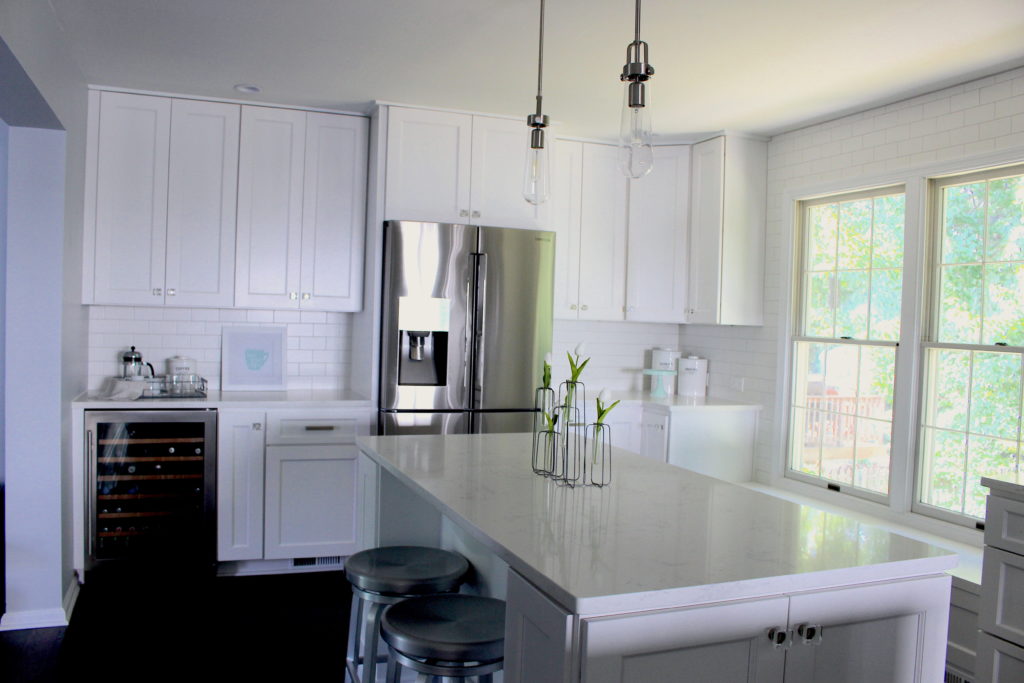
Joe loves French Press coffee, so we set up a cute coffee tray… for weekends, since we never seem to have time for French Press during the week. Where is the tray from? You guessed it… Magnolia Market.
To the right of the refrigerator, we’ve been putting the food out that pairs well with coffee. Super cute cookies, snacks, and coffee canisters are from West Elm.
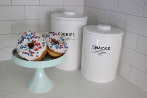
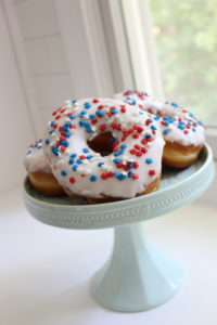
I know our kitchen is insanely white, so the two little hits of color above are kind of it. But isn’t it such a pretty mint green color?? I found the cake plate from a place called Lights & Decor for All Occasions. I don’t know how I came across it or how it took me so long to know it existed, but it has such cool and affordable decor!
Kitchen Hardware
The Pendants above the islands are from Shades of Light, and we selected them for the industrial aspect they added to the kitchen. We originally wanted something bigger, but with somewhat low ceilings, I think we made the right choice.
We chose the matching chandelier to go over our kitchen table… The lights go really well with the aluminum bar stools and dining chairs as well. For the kitchen table, we went with a farmhouse table (surprise, surprise), but the aluminum chairs and industrial pendants tie it back to the “modern industrial farmhouse” kitchen decor:)
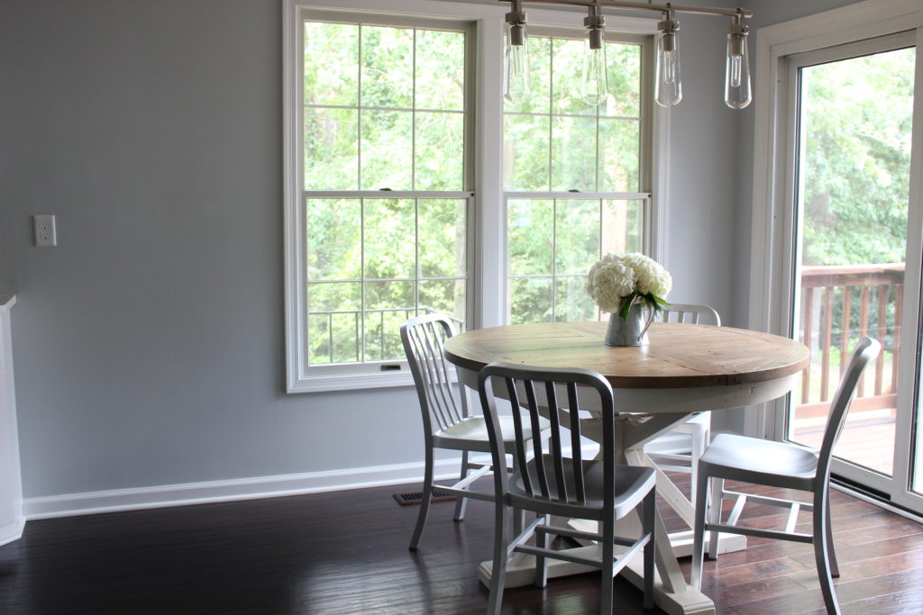
I know there’s another big blank wall… Wall decor TBD.
The glass knobs were a little bit of a risk, but they turned out great! The square shape actually prevents them from adding as much of a “girly” element as I was hoping for, but I’ll take what I can get.
The Bump Out
As mentioned in a previous blog post (link here), day one of demo, we found water pipes in the wall that we couldn’t hide. We had to build a little 5″ bump out wall to hide them. Again, felt like the sky was falling at the time… Cleary I was way too consumed by this kitchen. Now complete, the bump out adds some much-needed dimension to the kitchen!
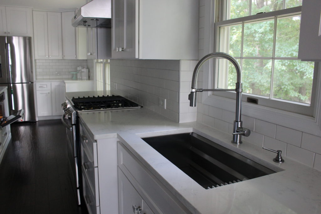
We used the bump out to highlight the stove and surrounding drawers. The initial concern was that it reduced the already-minimal walkway around the islands, particularly in front of the oven door. Placement worked out really well, though, because the oven falls right in the opening between the islands.

Lighting
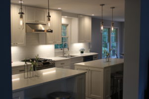
Another somewhat odd thing about my taste preferences is that I really don’t like warm light. You can probably guess by looking at a VERY white kitchen, on the spectrum, I always lean to the “cool” side. Blues and grays all day long. I feel the same way when lighting is involved. In the kitchen, however, I only really got my way with the under-cabinet lights.
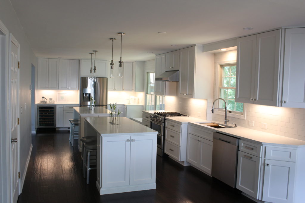
I think most people use under-cabinet lighting as mood lighting, but ours are definitely bright white. We like to use them as the main kitchen lighting at night… They’re definitely the lights that are turned on most often.

The pendants over the islands came with Edison bulbs… Again, all the rage. I love the look of the bulb itself, but I just don’t love the warm light that comes with them.
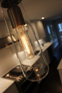
We may eventually swap them out for a cool light bulb if we can find one that looks nice, but for now, they work well in combination with the under-cabinet lights.

The Window Seat
When trying to figure out the kitchen design, I was really irritated with the big window right smack dab in the middle of everything. I was afraid it was going to make the kitchen look broken up. All that worry for nothing… Story of my life… We LOVE the window seat. I try to keep the kids away from almost everything in the kitchen, but the window seat is their spot. I keep their toys in the cabinets below it, and it’s the perfect place for them to park it while I’m cooking.
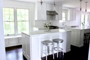
I thought the perfect way to end this post was with my adorable niece just taking a moment to herself on the window seat to drink her water… It doesn’t get much cuter<3

