Our first son was born a few years ago, during the slate grey/bright yellow combo craze. I still remember the wedding we attended with that color combo. Before that wedding, it had never even occurred to me… Probably because my world consists of blue, grey, and white. I don’t think I was even pregnant at the time, but we were definitely trying for a baby and therefore having nursery color conversations. That night, we reached an agreement… Grey and yellow was it!
Odd-Shaped Space
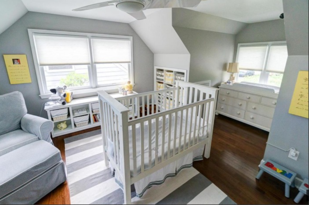
Our first home was a Cape Cod style home, but the previous owner had expanded the upstairs from one bedroom to two. The second bedroom was extremely small and oddly shaped. It would’ve been perfect for an office, but obviously that wasn’t going to happen…. Could you imagine having your newborn on the first floor and opposite corner from your bedroom? Not only would that distance scare me for safety purposes, but wow, that’d be BRUTAL during the nighttime visits. (and our house wasn’t even large)
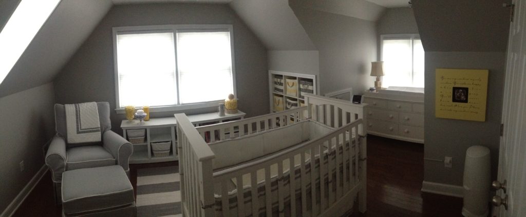
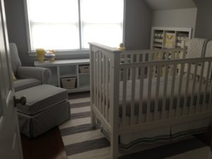
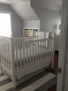
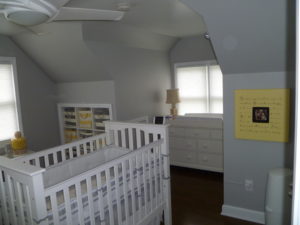
The room was so oddly shaped, we had to take a panoramic photo to get it all. The crib is in the middle of the room. I know a lot of people had a hard time with that. It’s not normal, but I didn’t have much wall space to choose from because of the windows and slanted ceiling. I know it’s different, but I kind of love it.

Now, you’ll notice that there isn’t any slate grey or bright yellow in the actual nursery. The colors shifted from slate grey and bright yellow to light grey and light yellow. I really did try to stay on-trend, but every time we attempted a slate grey or bright yellow accent, it just never felt right.
I wanted the room to feel soft. If you’ve ever seen the movie “Father of the Bride II”, you’ll remember the moment when Franck shows George Banks the completed nursery. It feels soft, warm, cozy, relaxing…. Like a little oasis you want to escape to. Obviously their budget was a little higher than ours, but I wanted the overall vibe to be the same. As anyone with kids knows, there is not much calm and relaxation when you bring a baby home. Shouldn’t the room at least have a somewhat calming effect??
And honestly, even through the haze of sleep deprivation, I would rock in that chair in the middle of the night while enjoying newborn snuggles and feel like I was experiencing a little piece of heaven.
The Accents
One of my favorite things in the nursery is the frame to the right of the crib from Sugarboo Designs. They carry many different quotes and different colored frames, so you can basically customize what you want (link here). We chose the lyrics from “You are my sunshine” since we sang that to David every night before bed<3 Definitely a frame we will always keep.
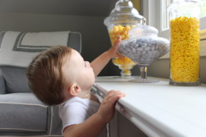
It’s hard to see, but on the bookshelf under the window, you may notice a bulk candy display. Yup, that’s right, we decorated a baby’s nursery with glass canisters filled with candy. Definitely not nominated for “Baby Proofers of the Year” award.
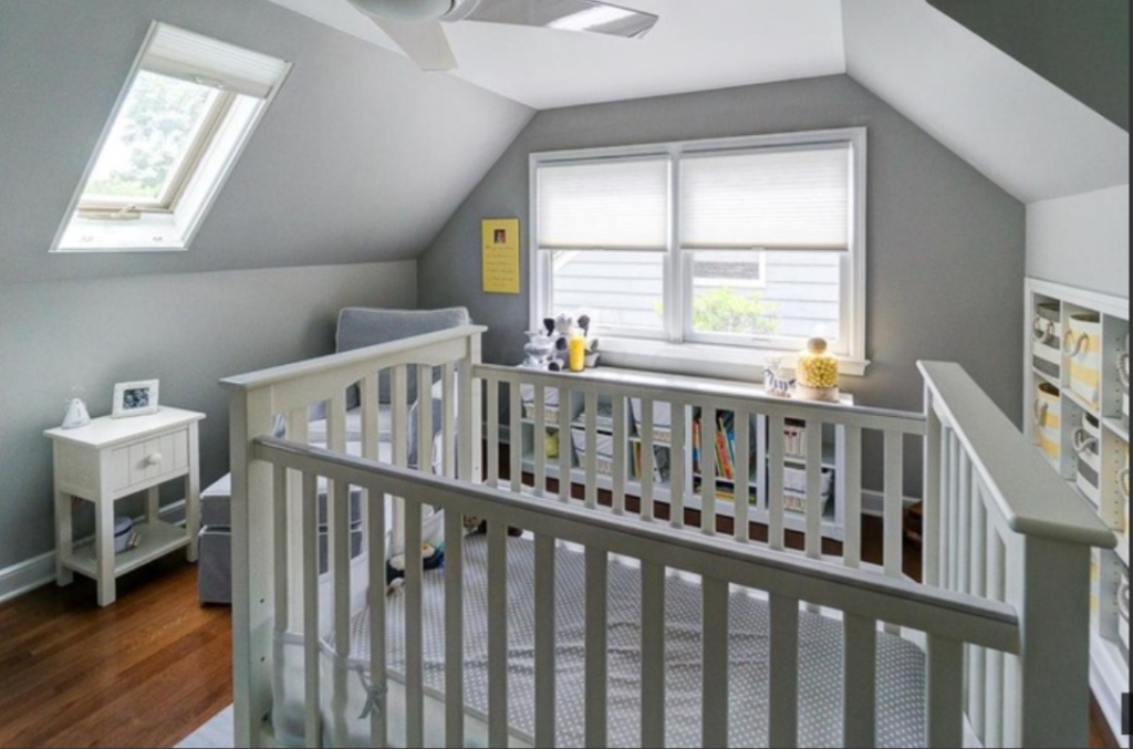
I don’t know what it is about a bulk candy display, but I think they’re fun and look awesome. They make me happy… Which makes sense since I have a slight (ok, not so slight) sugar addiction.
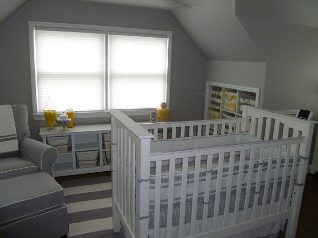
I know there were a lot of skeptics out there who thought those candy jars didn’t stand a chance. I was actually one of them and had every intention of removing them as soon as David could move, but they ended up surviving 3 years and two babies without a hitch! The kids were never in that room alone, and they really didn’t even notice the candy…
… Well, for the most part.
