We found out we’re moving!! So why not knock out one last big project haha… In all seriousness, we had been planning this design for months and already had the cabinets, custom for this space. I was determined to see this vision come to life before leaving in June.
The first thing we did in this house was knock down the wall between the kitchen and dining room to make the kitchen one, large room (that blog post linked here). We were left with a large kitchen and family room that were easy spaces to define. We had a decision to make on this last room. Would you keep it a formal living room? Or would you turn it into a formal dining room? Some kind of combo??
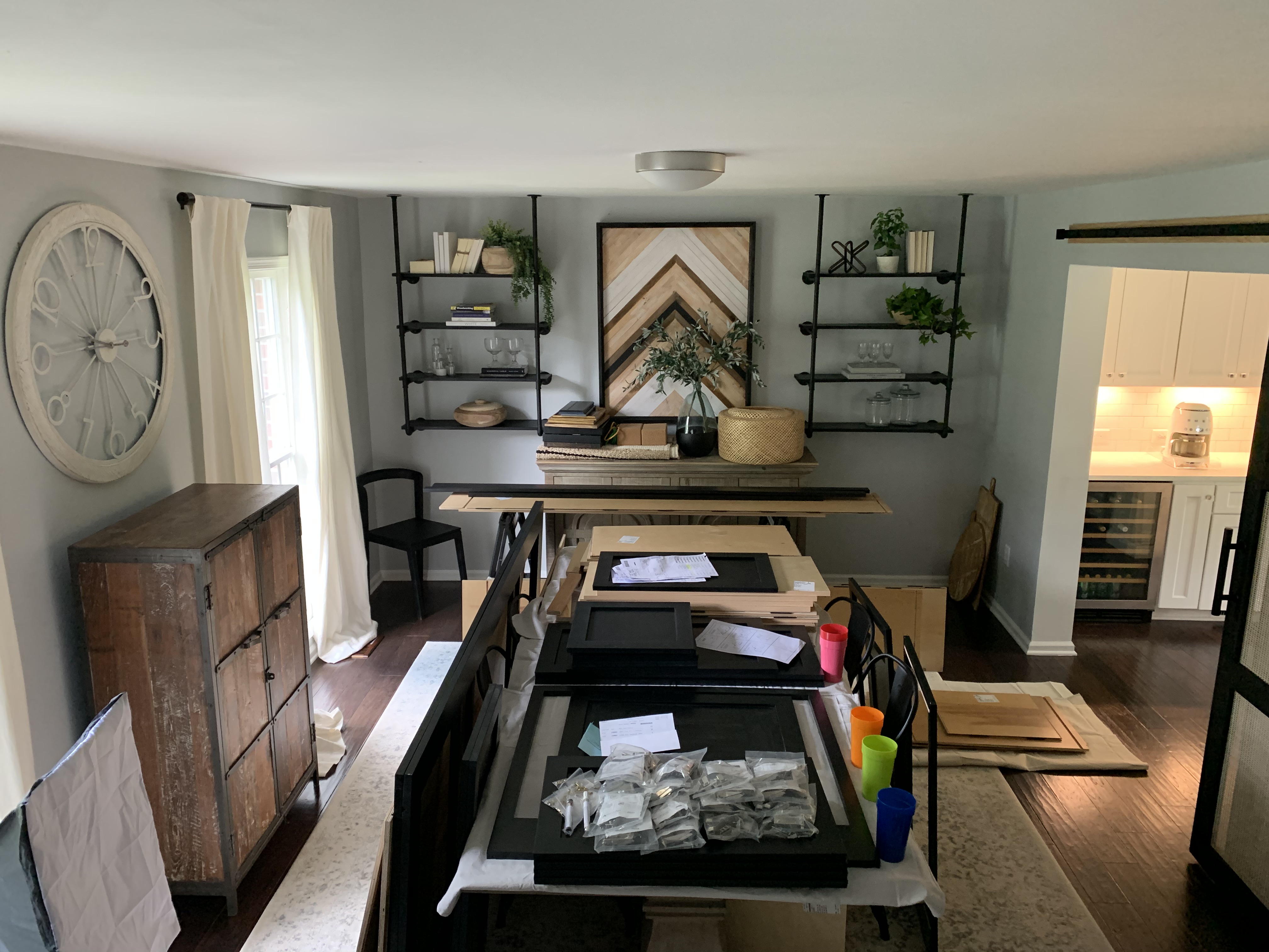
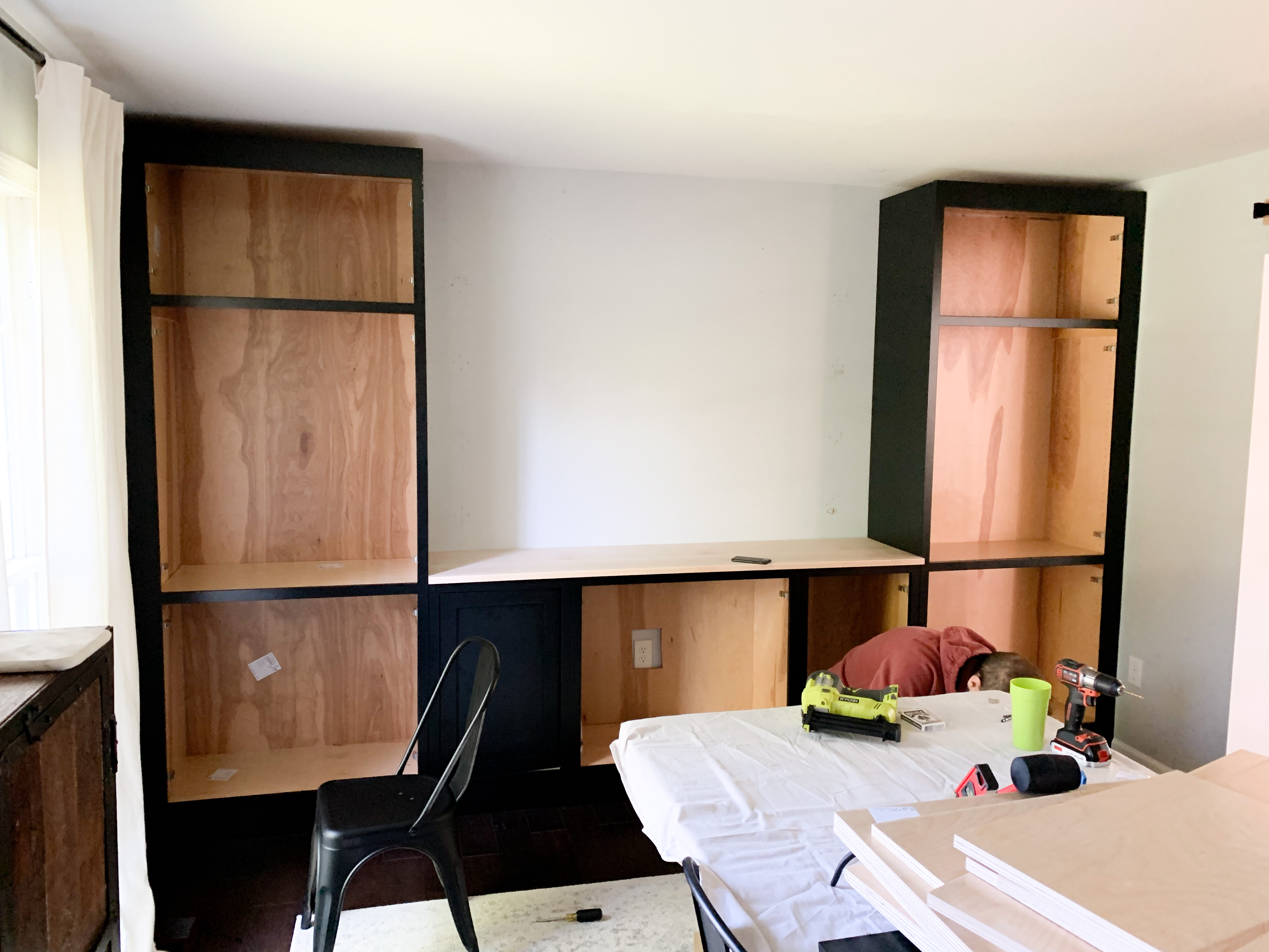
BEFORE:
We chose to make this space a dining space, but until that “officially” happened, it was mainly our dump zone… I’m not proud.
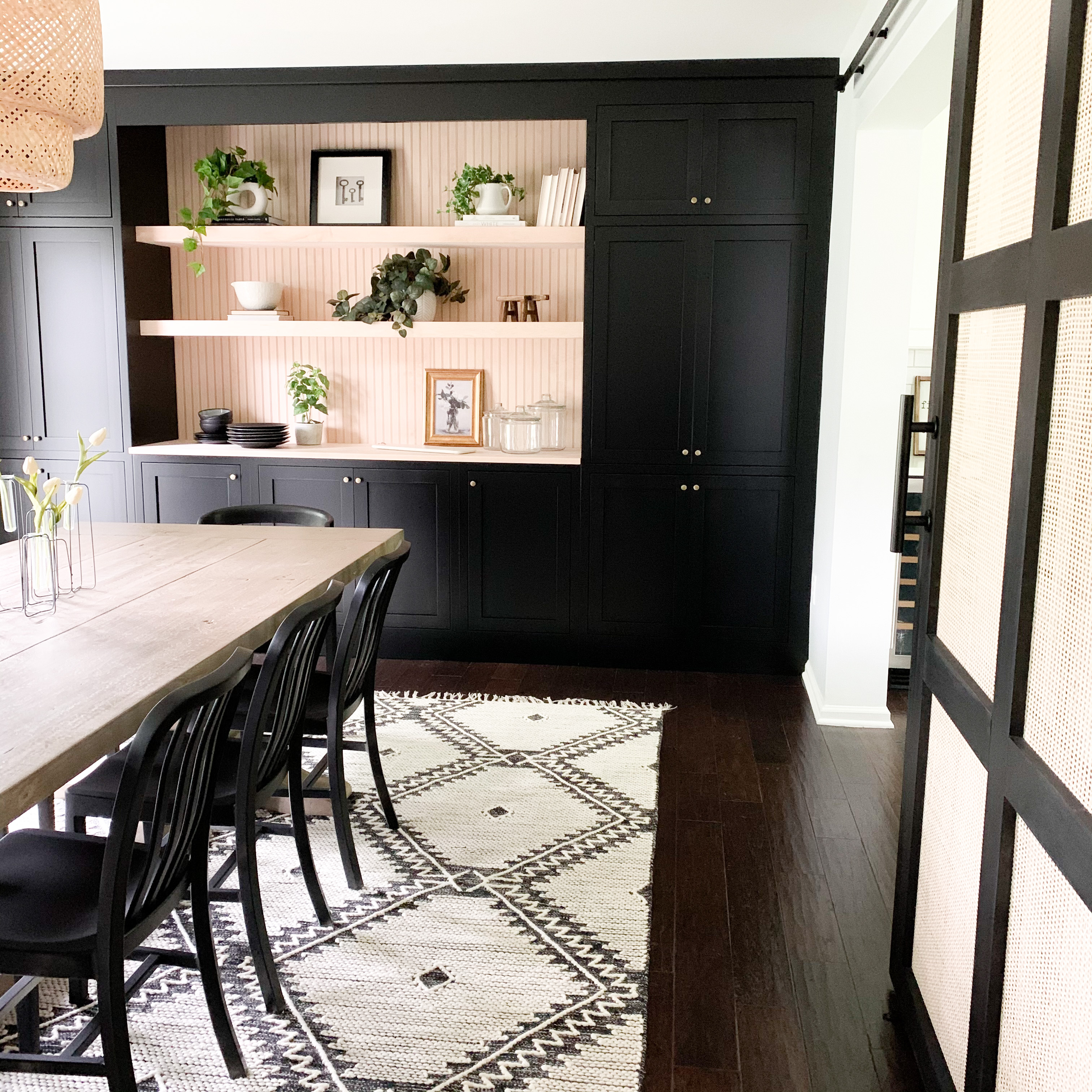
It’s a good-sized room, so I always imagined some sort of statement wall you could glimpse from the kitchen. Doing a wall of cabinetry combined with open shelving is the perfect way to get a statement wall that also functions as storage.
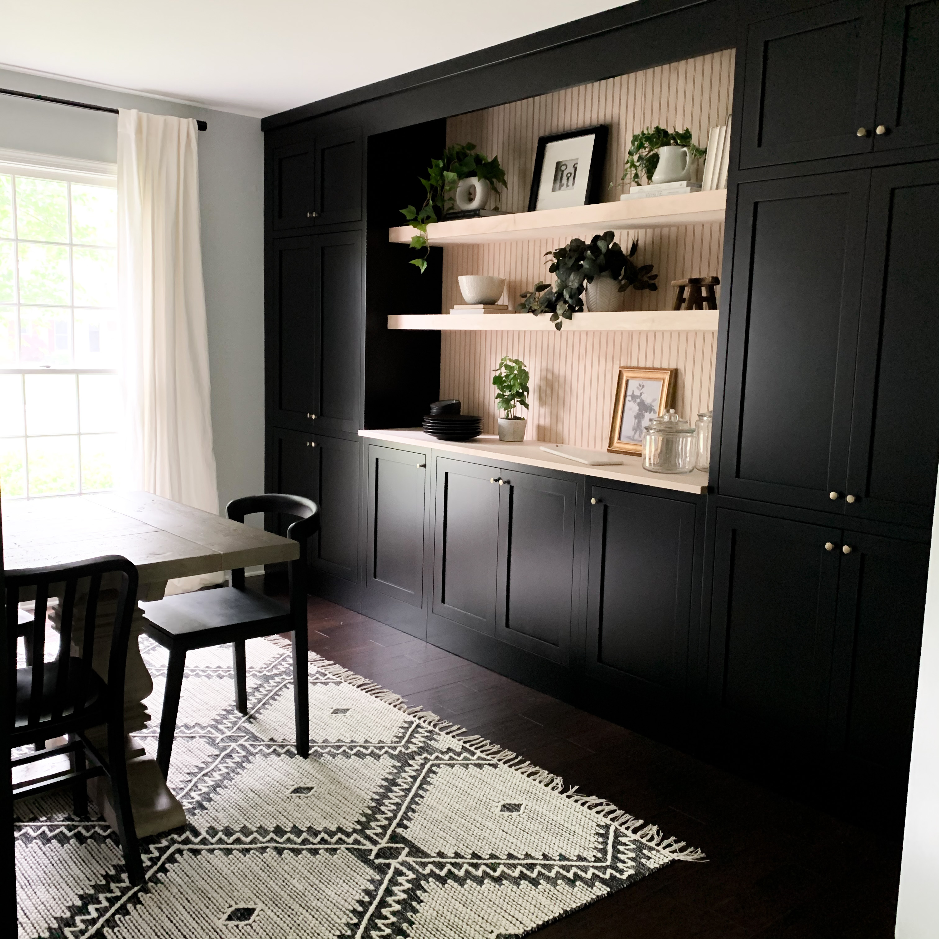
The Cabinetry
I debated using IKEA pieces to get the built-in look on this wall, but then a friend shared in her IG stories the cabinets she was currently using from Cabinet Joint. They had the inset cabinets I’ve always wanted, for a fraction of the cost I’m used to seeing! I immediately reached out to them and pitched the idea of this dining room project and was BEYOND excited when they agreed to partner with me on this project, especially as the key component. My vision for this space could finally come to life!
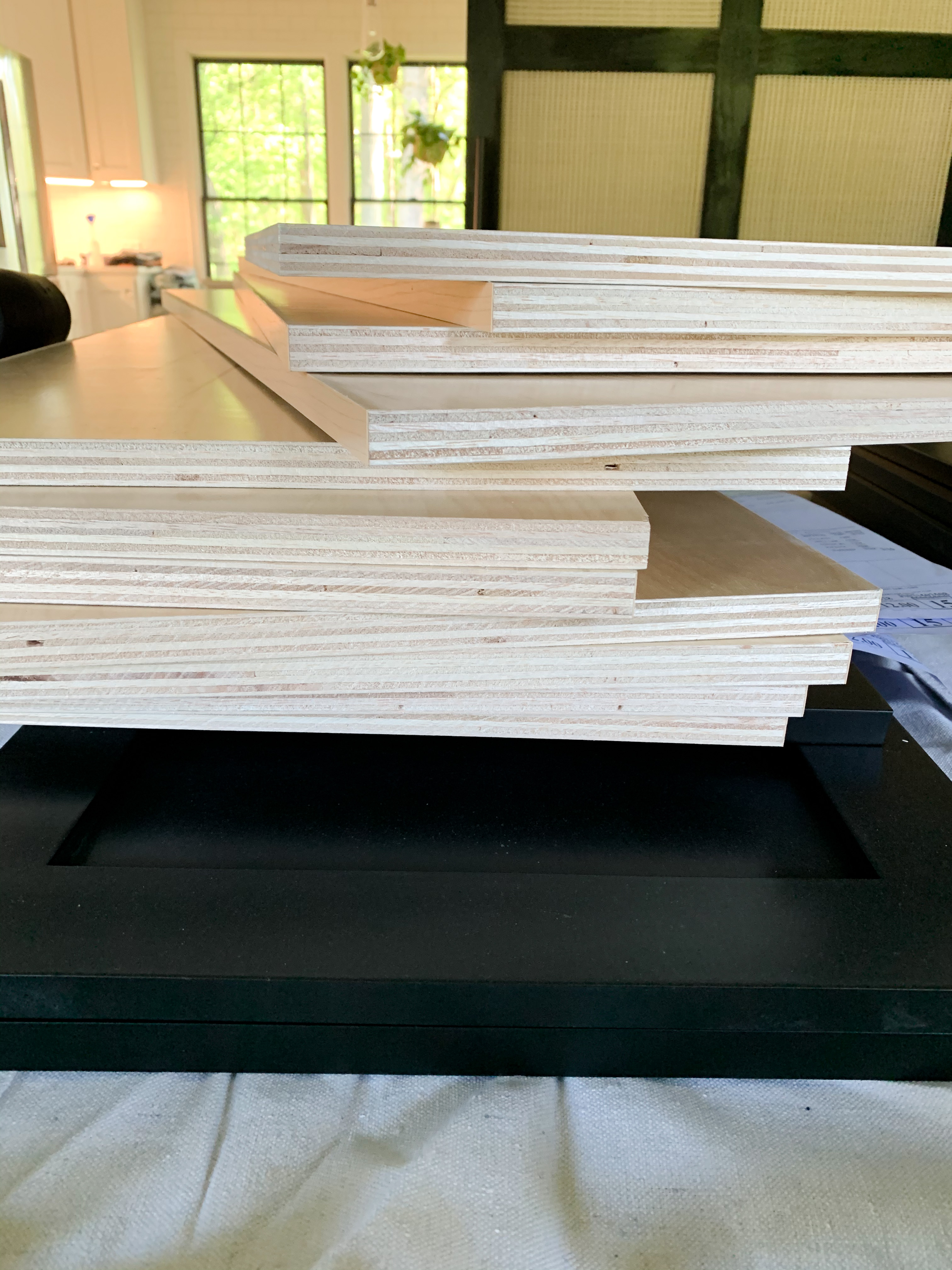
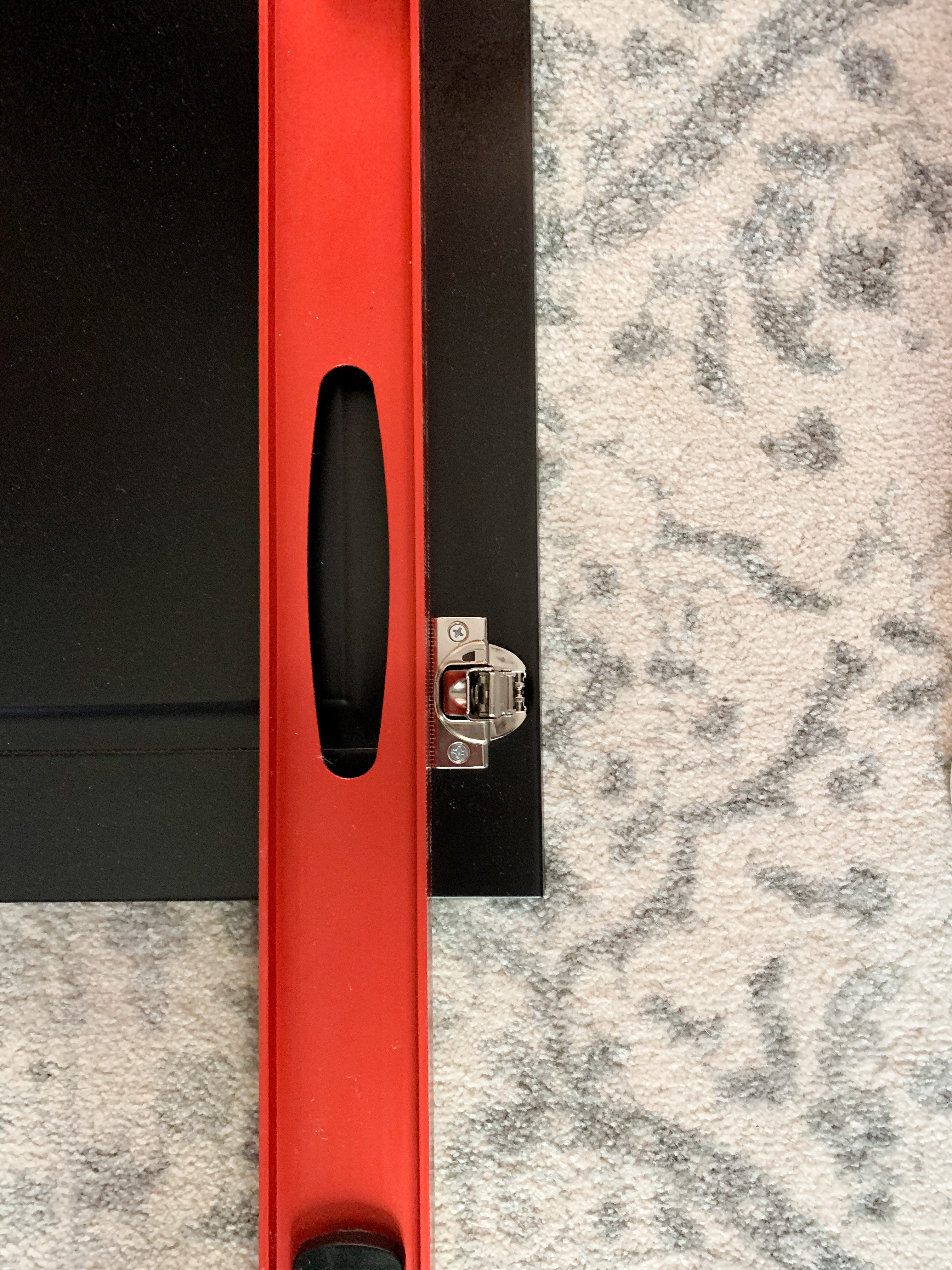
After sending a few inspiration pictures and a little sketch, we set up a phone call to discuss everything in more detail. The designer who helped me through the whole process sent renderings right away via email and samples in the mail to help me finalize design choices. If you know me at all, you know I’m one of the most indecisive people… she’s the best!!
The Assembly
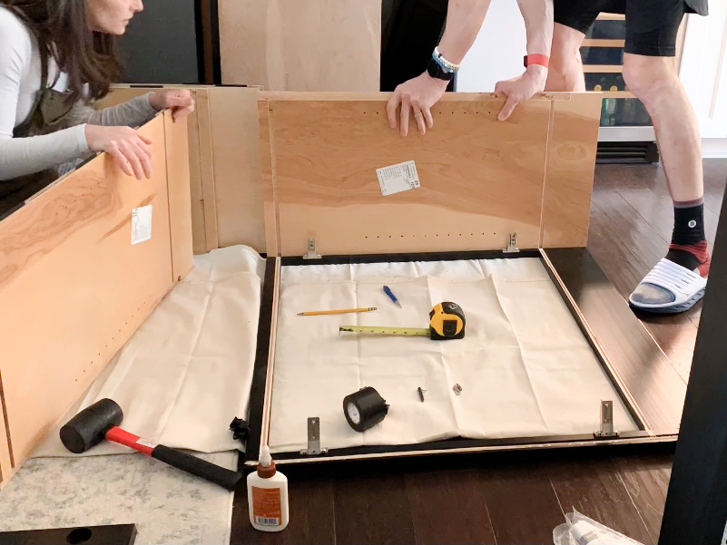
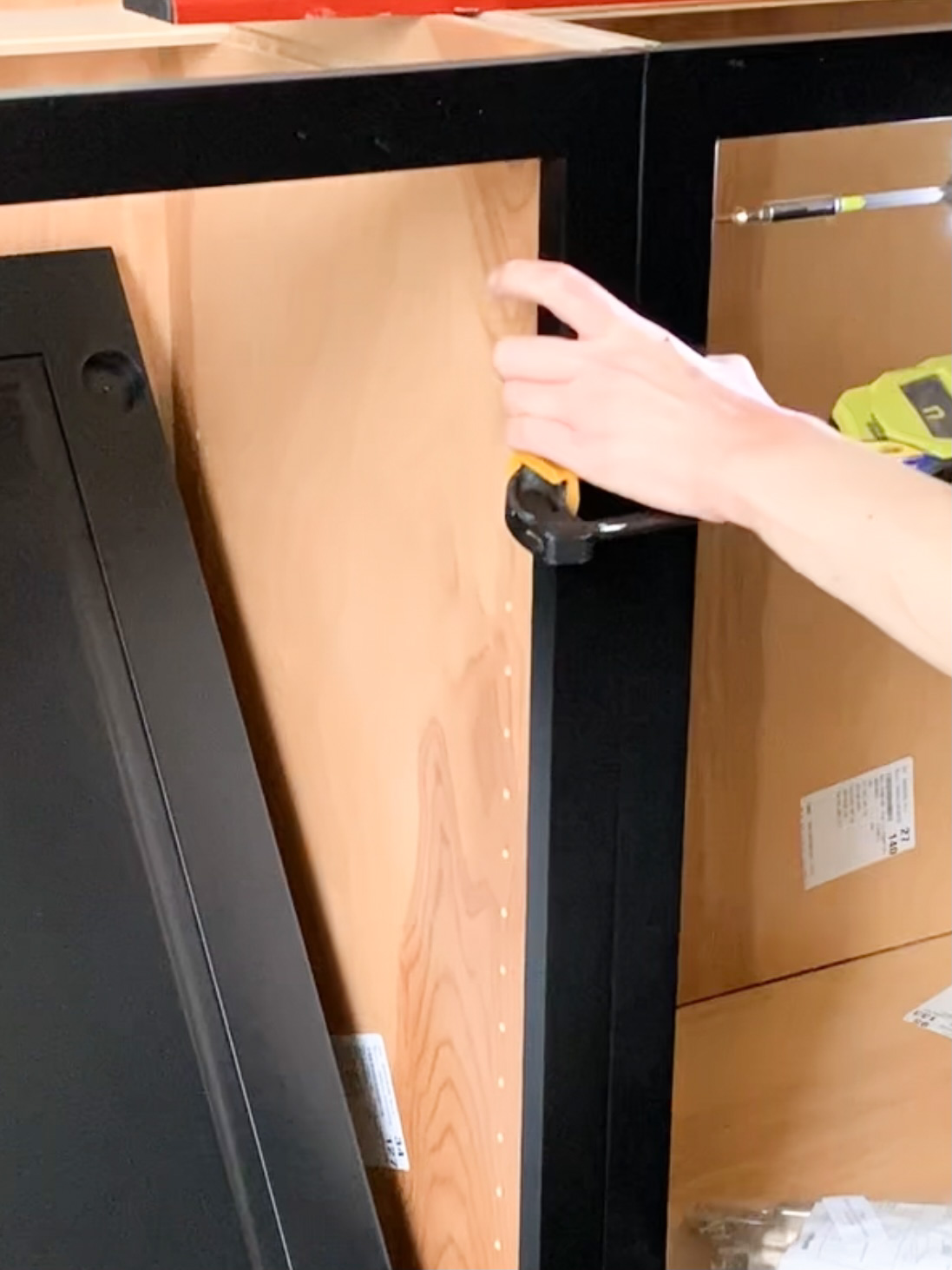
When the cabinets arrived, we were a little overwhelmed… it was a big order, lots of parts! Cabinet Joint had talked me through everything on a phone call and also directed me to their library of info videos on their site. Once we actually got started on assembly, the overwhelmed feeling went away. The base boxes went together exactly as the video demonstrated and went so quickly!
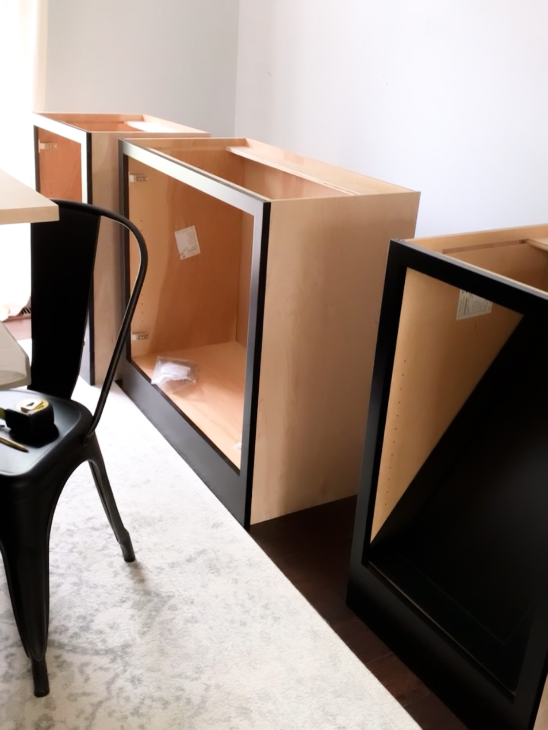
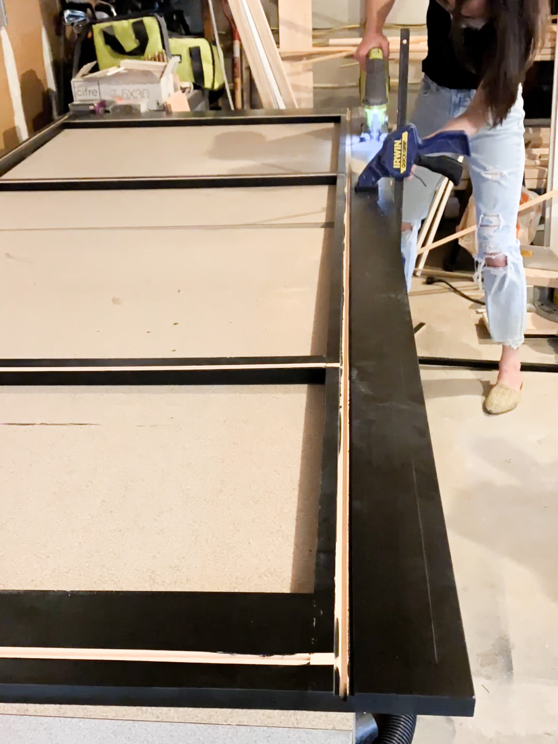
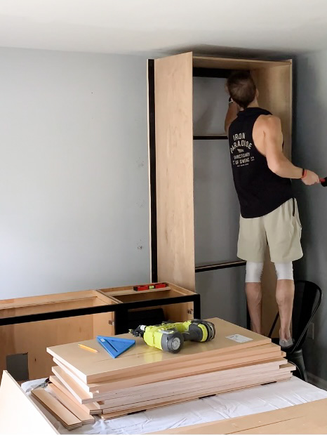
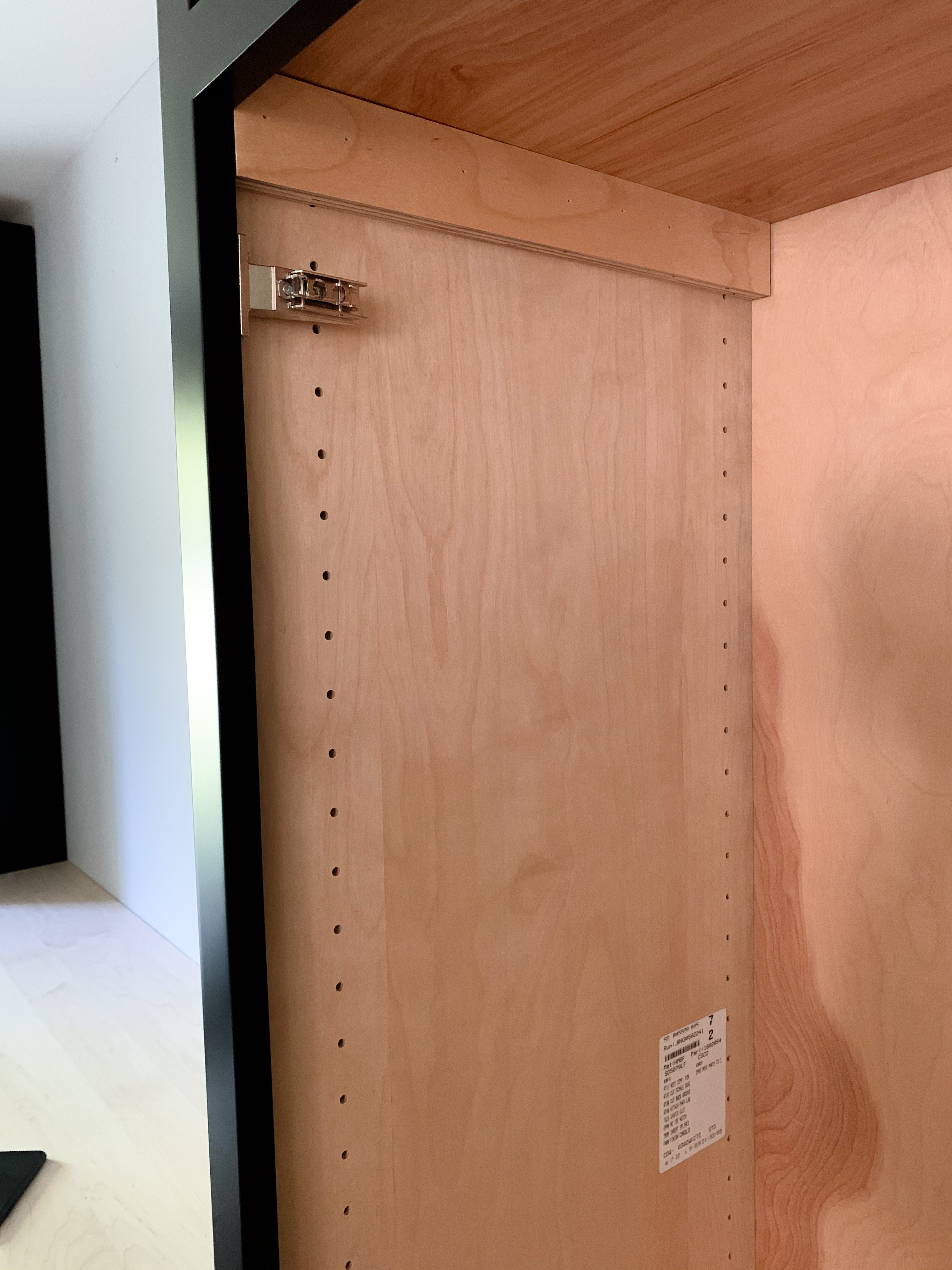
The two taller boxes were more complicated for two reasons. One, they needed to be assembled in an upright position because of the ceiling height. Two, I had to scribe the extended stile (below left photo) to get it to fit perfectly in the width of our room. I was originally planning on using the table saw to trim off the 1 inch on both sides, but I quickly realized how uneven walls are. I wanted to avoid large gaps, so I followed this YouTube video to figure out how to scribe and then cut on the line I drew with a jigsaw.
Cabinet Cost
I absolutely loved working with Cabinet Joint on this project… I loved the ease of it, am obsessed with the quality of these gorgeous cabinets, and loved working with such a great team of people. Let’s talk cost, though. Cabinets are NOT cheap. I learned that when we did our kitchen four years ago. The cost breakdown for this set of cabinets… boxes, doors, frames, hinges (Blum, the best!), maple countertop, slab filler and trim, and all the design services and free shipping… was $4,800. Their company recently had a few cost adjustments due to the crazy high lumber prices right now, and even after those adjustments, the price only increased $200.
I was curious how this price compared to my original plan of using IKEA. I used the IKEA design tool to match this design as best I could. For the cabinets alone, it was $2500. That didn’t include a countertop, trim, or any lumber needed to build it out to fit into the space. I’m guessing that this design would be at minimum $3,000 using IKEA pieces… that’s without the inset design that I love (and is so crazy expensive with assembled cabinetry) and the solid maple doors and cabinet frames.
I even tried to calculate what it would cost to DIY the cabinet boxes and just order the doors. Even that way would still end up costing at least $2500-3000…. lumber prices are SO high right now.
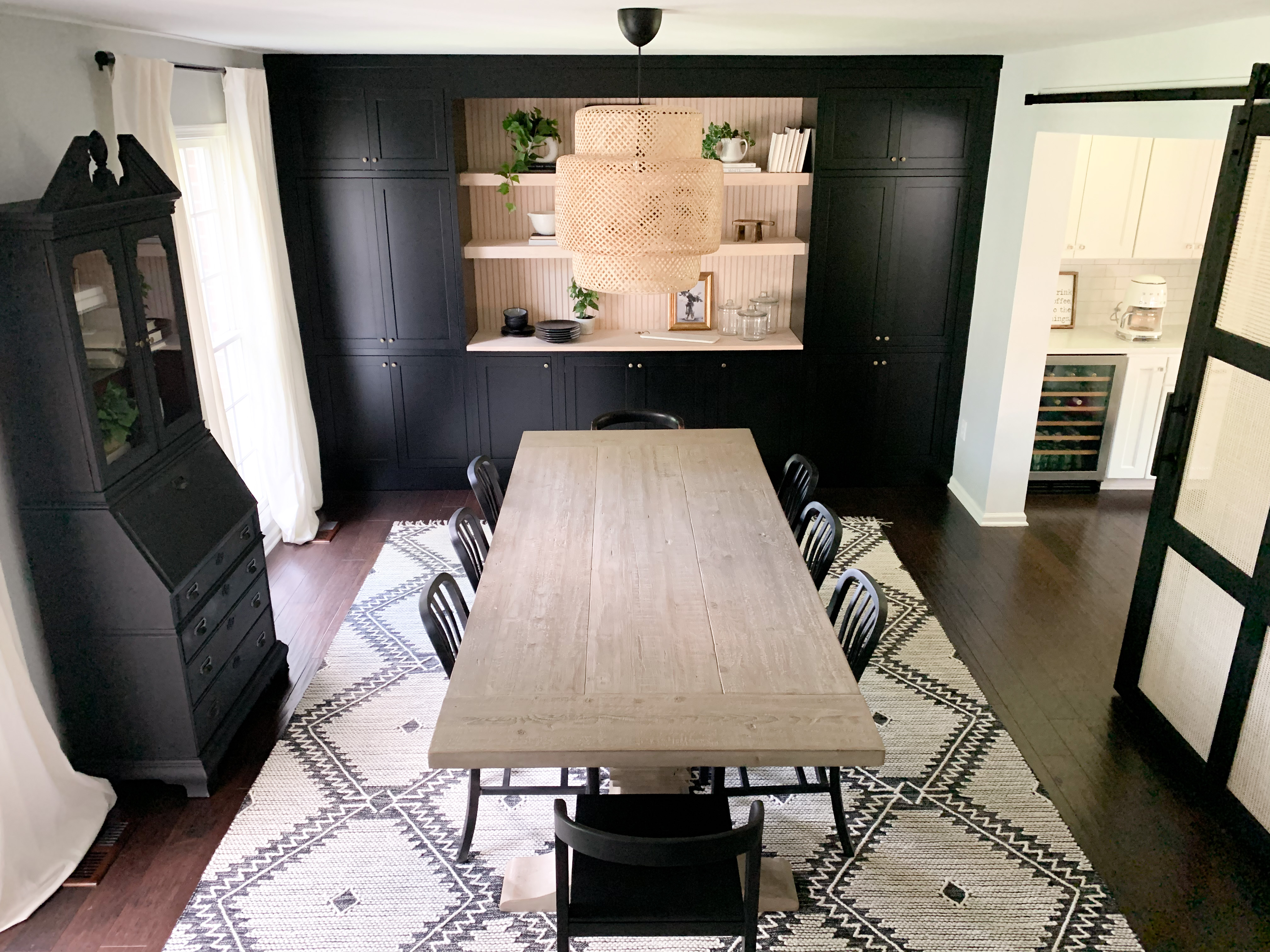
I really can’t imagine finding a better price for the quality and the ease of assembly… I truly have no complaints and couldn’t be happier with the finished product!
The Shelves
I knew I wanted floating shelves in the opening between the tall cabinets, but I also was in a time crunch and wanted a project that wouldn’t make me want to pull out all my hair. These DIY floating shelves are PERFECT. I’ve seen a handful of DIY’ers do shelves this way, and I can now say that they truly are as “easy” as people say they are!
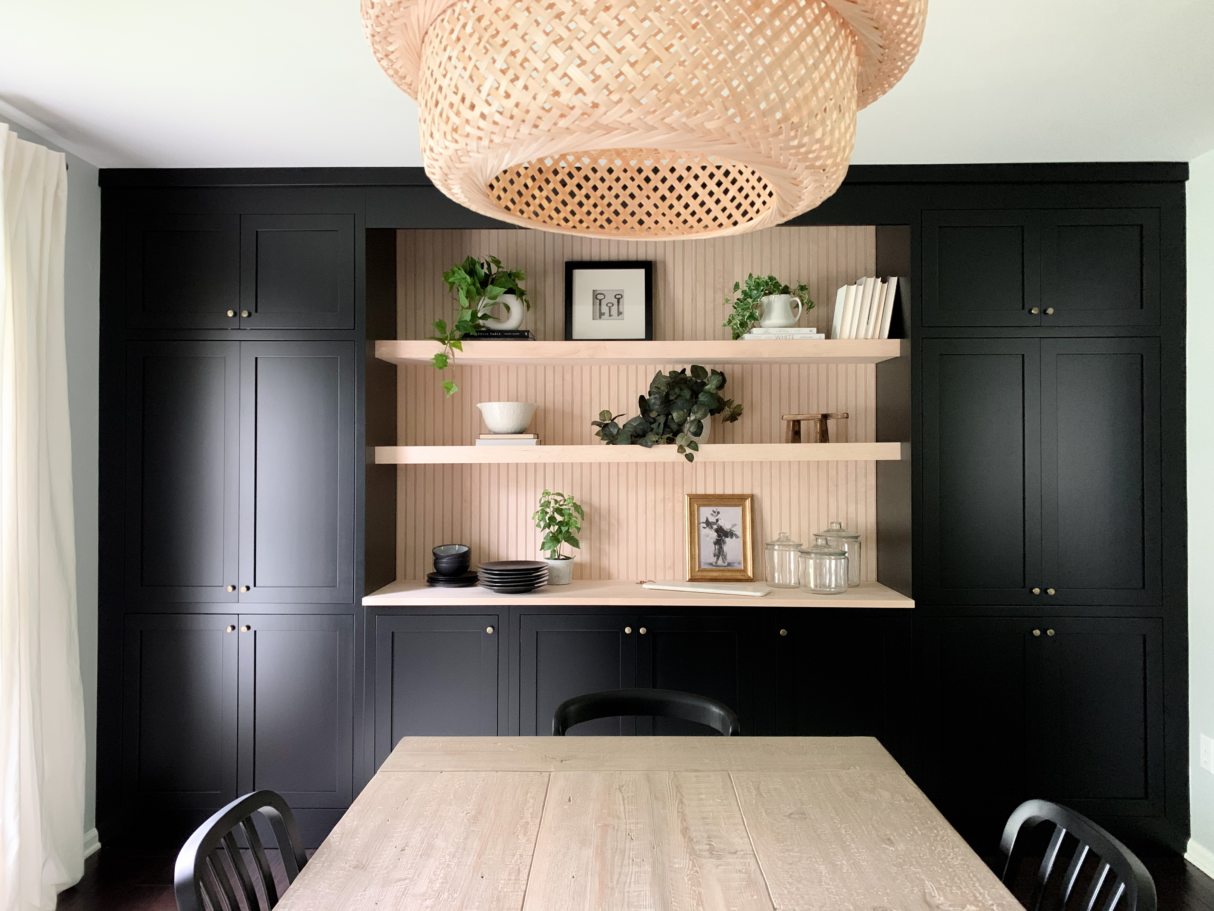
The original plan was to use a fluted trim behind the floating shelves. These beaded maple project boards were such a great look and tied back to the countertop!
I followed @laurenelizabethburke ‘s tutorial on IG (coffee bar highlight bubble) and used 2×2 pine boards to create the frame that screwed into the studs. I used glue and screws anywhere I could to make it as sturdy as possible. The shelves are 2.5″ thick. If you want thinner ones, Angela Rose Home has a great blog post to follow!
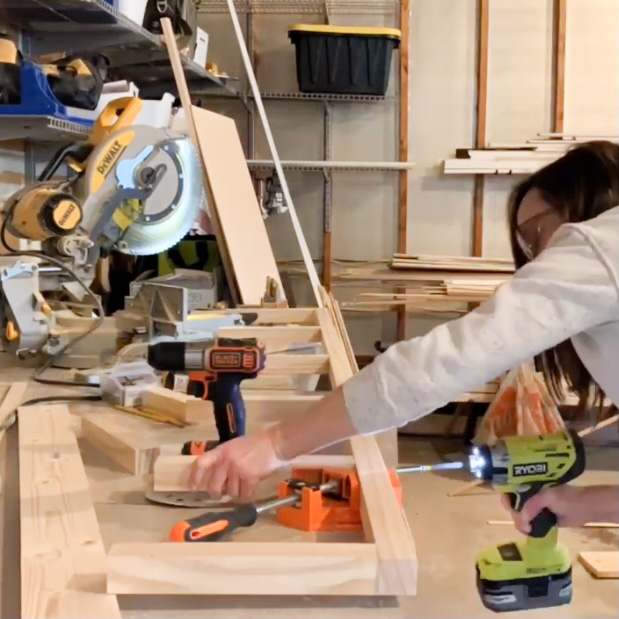
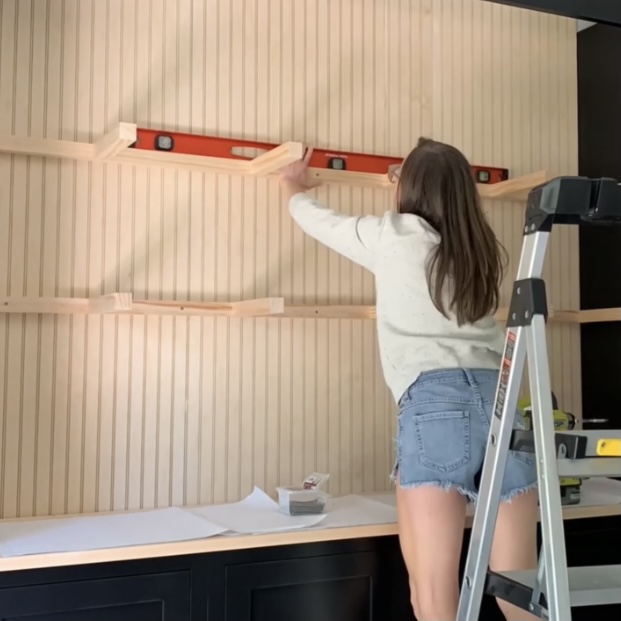
Home Depot cut a 4×8 sheet of plywood into four 12 inch thick strips. I used these pieces to get the exact cuts needed for the frame. I glued and nailed a piece to the top and bottom of the frame, then covered the front with a 1×3 maple board.
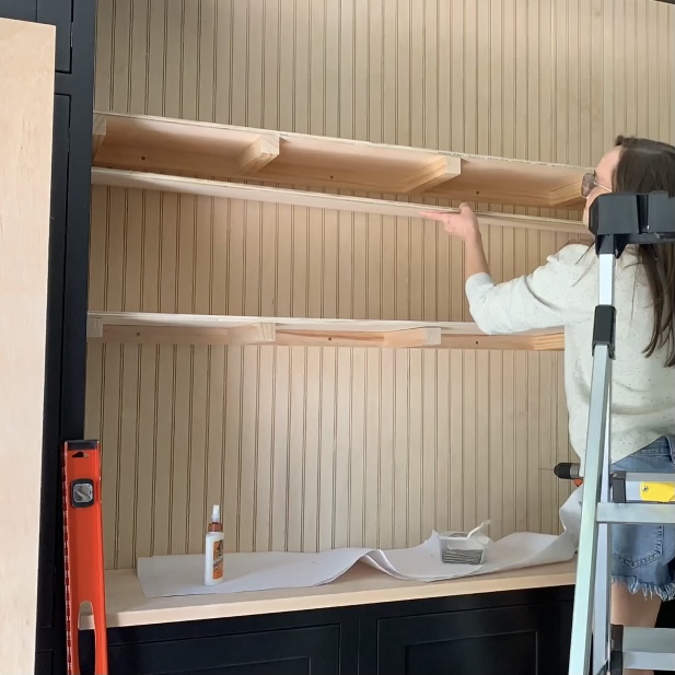
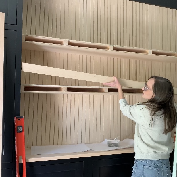
These shelves tie the room together perfectly… The maple beading, the rattan pendant, and the cane door off the black? I can’t get enough!
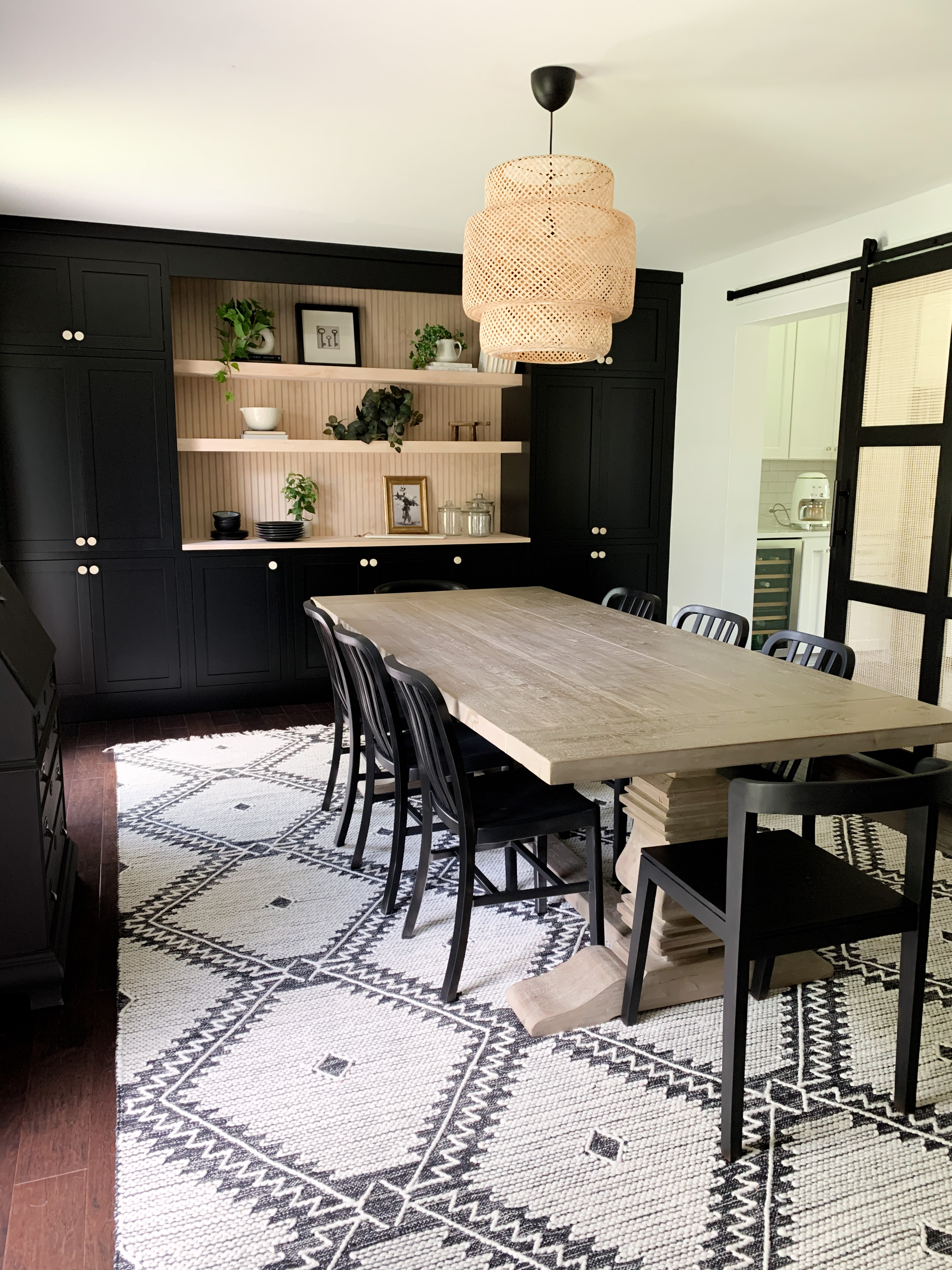
The Rest of the Room Details…
We had big plans of getting new dining chairs and creating a little reading corner/nook next to the cane sliding door…. a cozy leather chair and more DIY shelves were on my agenda. Once we found out we were moving and only had two weeks to renovate this room, that vision had to shift to the new house.
I used chairs we already had on hand, linked here from Crate & Barrel. The chairs on either end of the table are Homegoods finds that I painted black. Here is a similar option from Target. The pendant light above the table is from IKEA. I painted the hutch black but kept the inside of the glass display the stained wood for contrast. This piece was my grandma’s, and I absolutely love the traditional/meaningful touch to such a modern space.
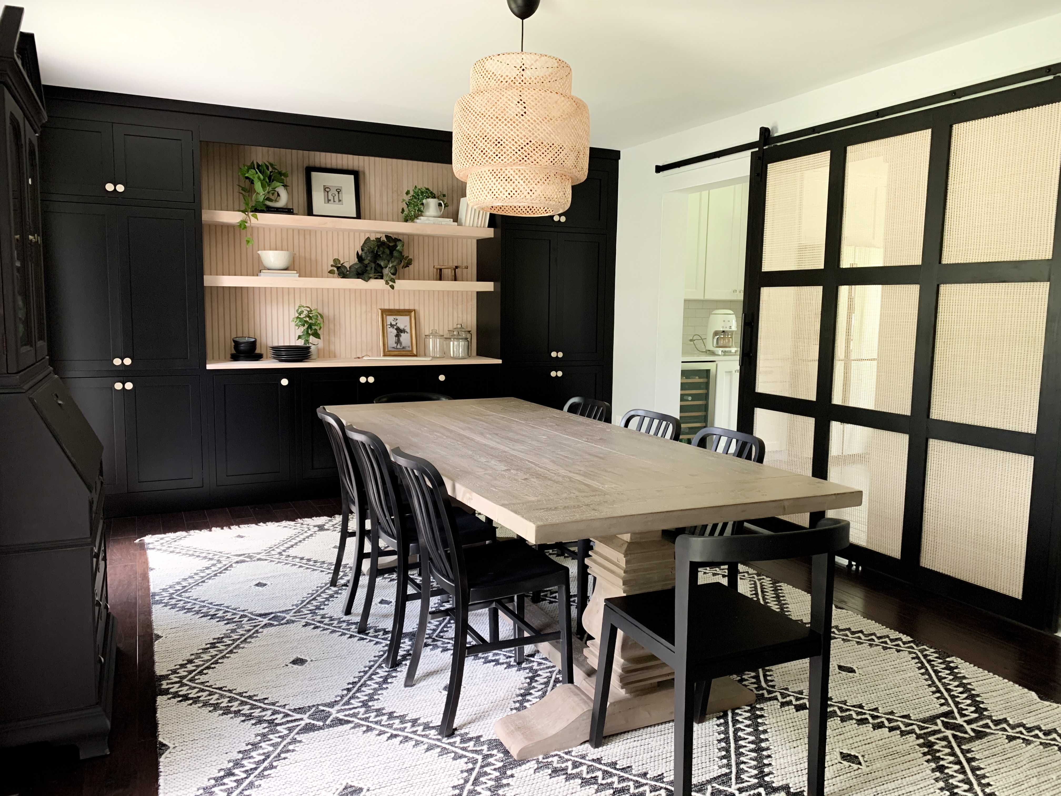
I get asked about the table all the time. It’s from Restoration Hardware, the salvaged wood trestle table, but we found it at an RH Outlet on opening day… the discount we got had to be a record. It was tough to find a comparable one at a lower price, but here is an option from Wayfair. The rug makes a statement, and I love it so much! (from Boutique Rugs linked here).
PAINT – The cabinets match closely to Sherwin Williams Tricorn Black. We took a cabinet door to SW to match and use to paint the frame of the cane door. I used a matte black spray paint on the chairs. Wall color is Benjamin Moore Silvery Moon… a very light grey.
Last, but not least, the cane door is another DIY favorite… I’ll link here to the blog post!
This post may contain affiliate links… See disclosure linked here.
