We’re coming up on almost a year since we renovated our master bath. I figured it’s about time to get all the info in one place. Maybe a little late? That doesn’t sound like me… When we moved into our home three years ago, we knew that the kitchen needed to be tackled first (Kitchen Reno post found here). It was in rough shape! But a VERY close second was the master bathroom. At first glance, it was neat and clean and didn’t look terrible, if you could overlook the predominantly yellow color. Then we moved in and started using it. We quickly realized it was going to be hard to overlook the worn and broken floor tile, rusted/molded fixtures, and the cracked sinks.
Here are a couple before pics just for the heck of it…


.
Modern Farmhouse – My Go-To!
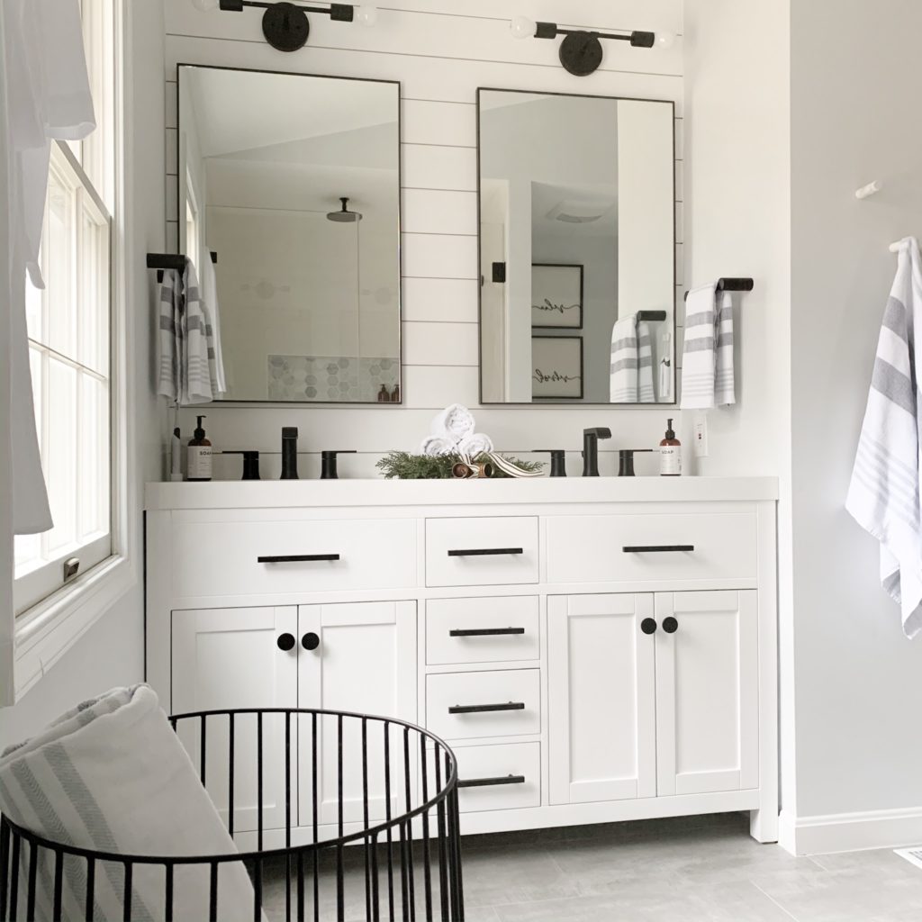
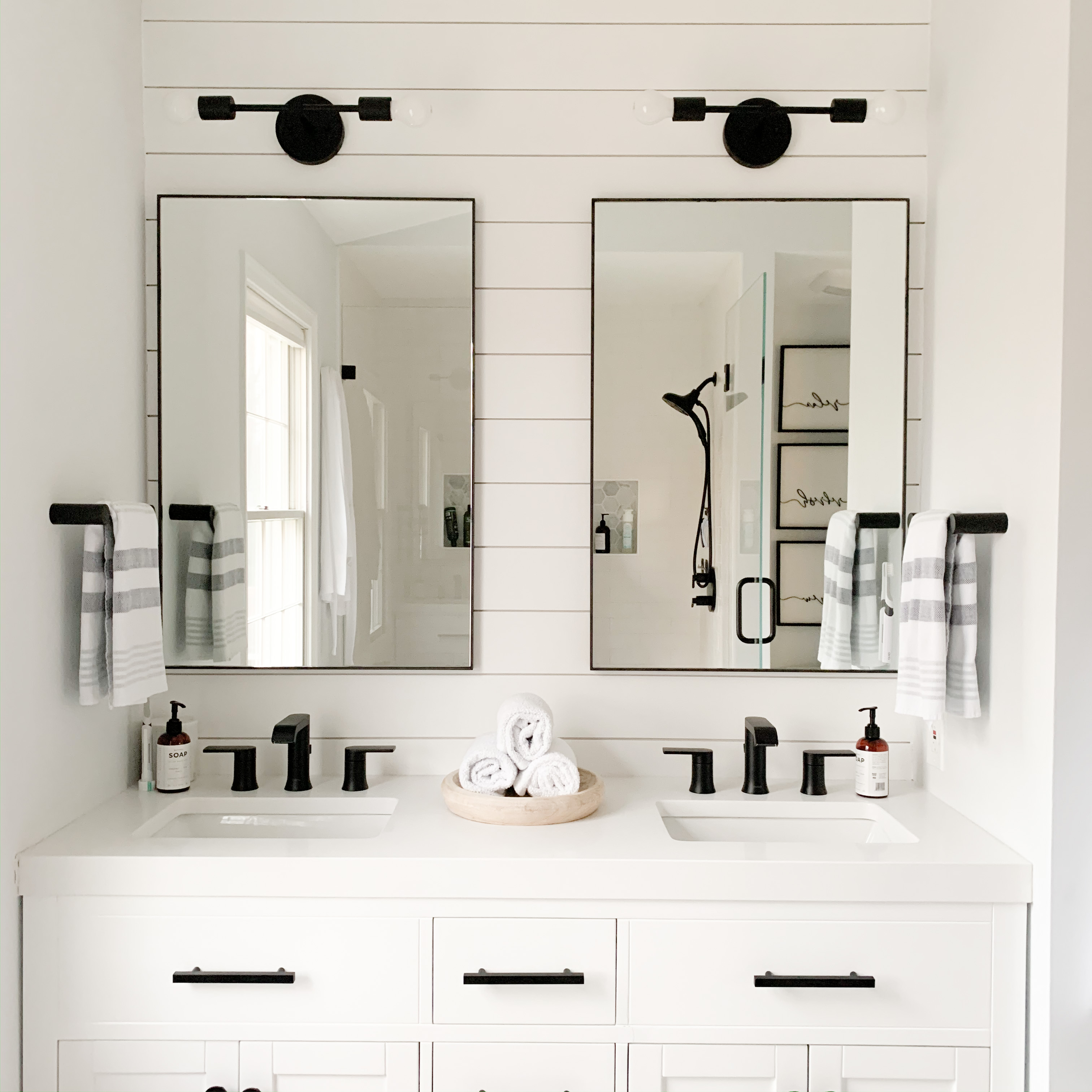
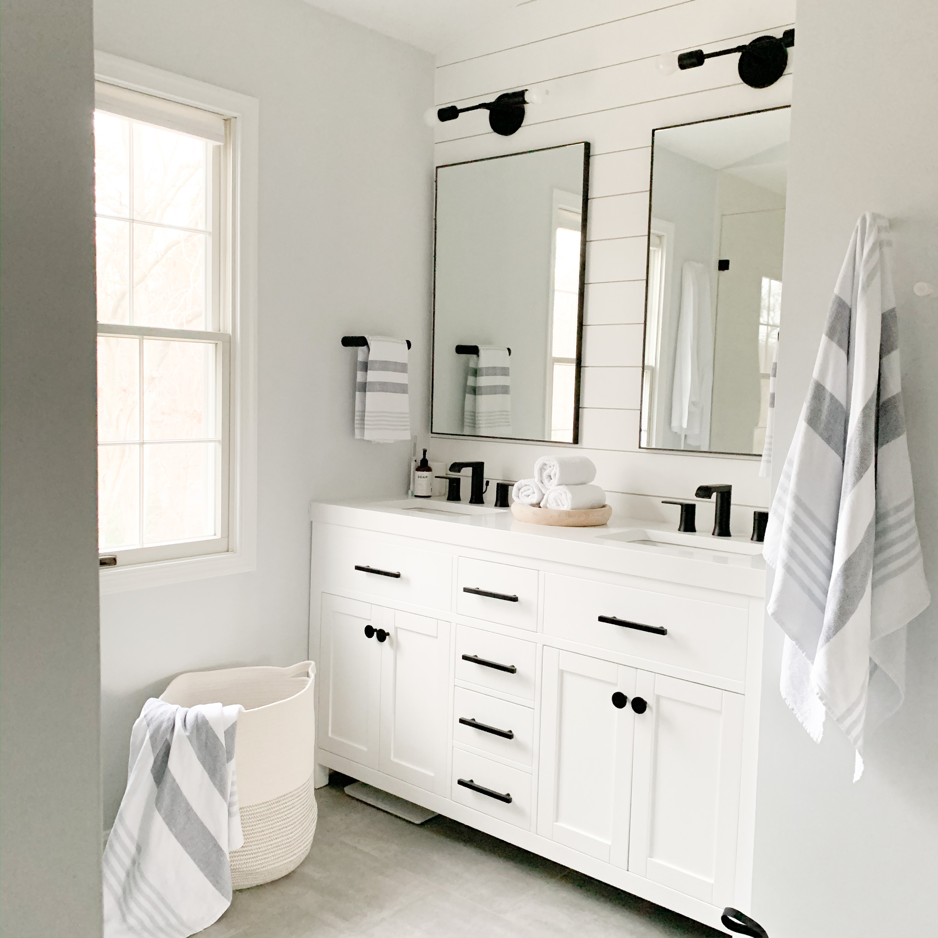
The budget was tight, so the footprint needed to remain the same. It wasn’t big. We stuck with white and grey to make the space feel as large as possible. This vanity was one of the lowest priced white vanity base options we could find, and we’ve been very happy with it so far! This link is for the base only since we went local for the white quartz countertop. I do believe that you get what you pay for, and it’s definitely not perfect. It’s not the real wood we dreamed of doing, but it works and looks great! (That budget always gets in the way) We did swap out the knobs and pulls which made a big difference. We got both the pulls and the knobs from CB2.
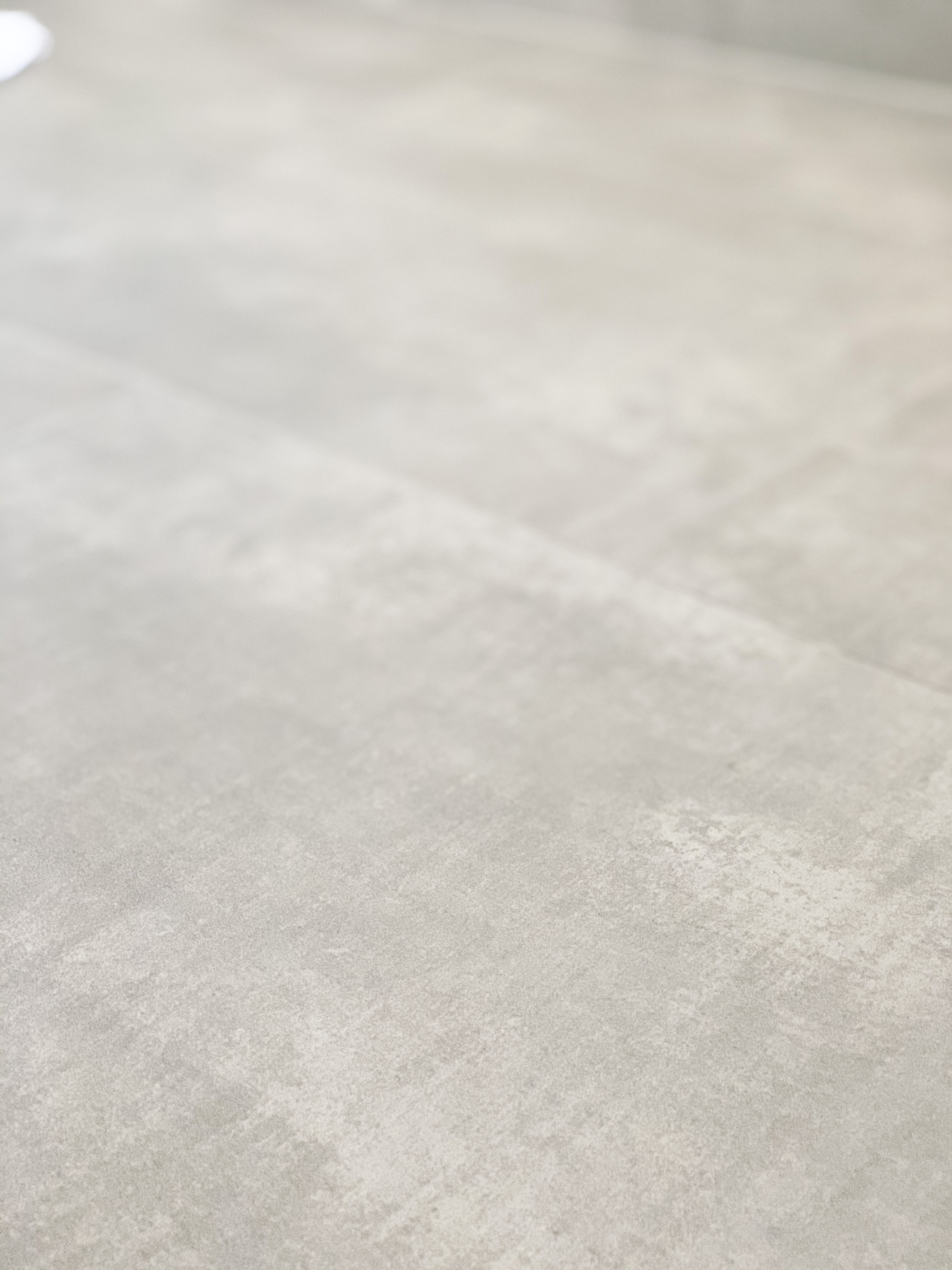
For floors, we were originally going to go with the tile that looks just like wood planks, but we didn’t want it to clash with the wood flooring in the bedroom. Instead, we liked the idea of imitating concrete floors with this gorgeous tile. The perfect way to keep the space light and bright, while also adding in a modern farmhouse element!
To continue the modern farmhouse theme, we stacked white shiplap behind the mirror. Another piece, and one of my favorite things in the bathroom, is the uneven subway tile in the shower. I love subway tile in general, but this tile is longer/thinner and has a rustic, uneven appearance. Just be sure to order enough! We learned our lesson the hard way.
.
Our “Pop” – Matte Black Fixtures
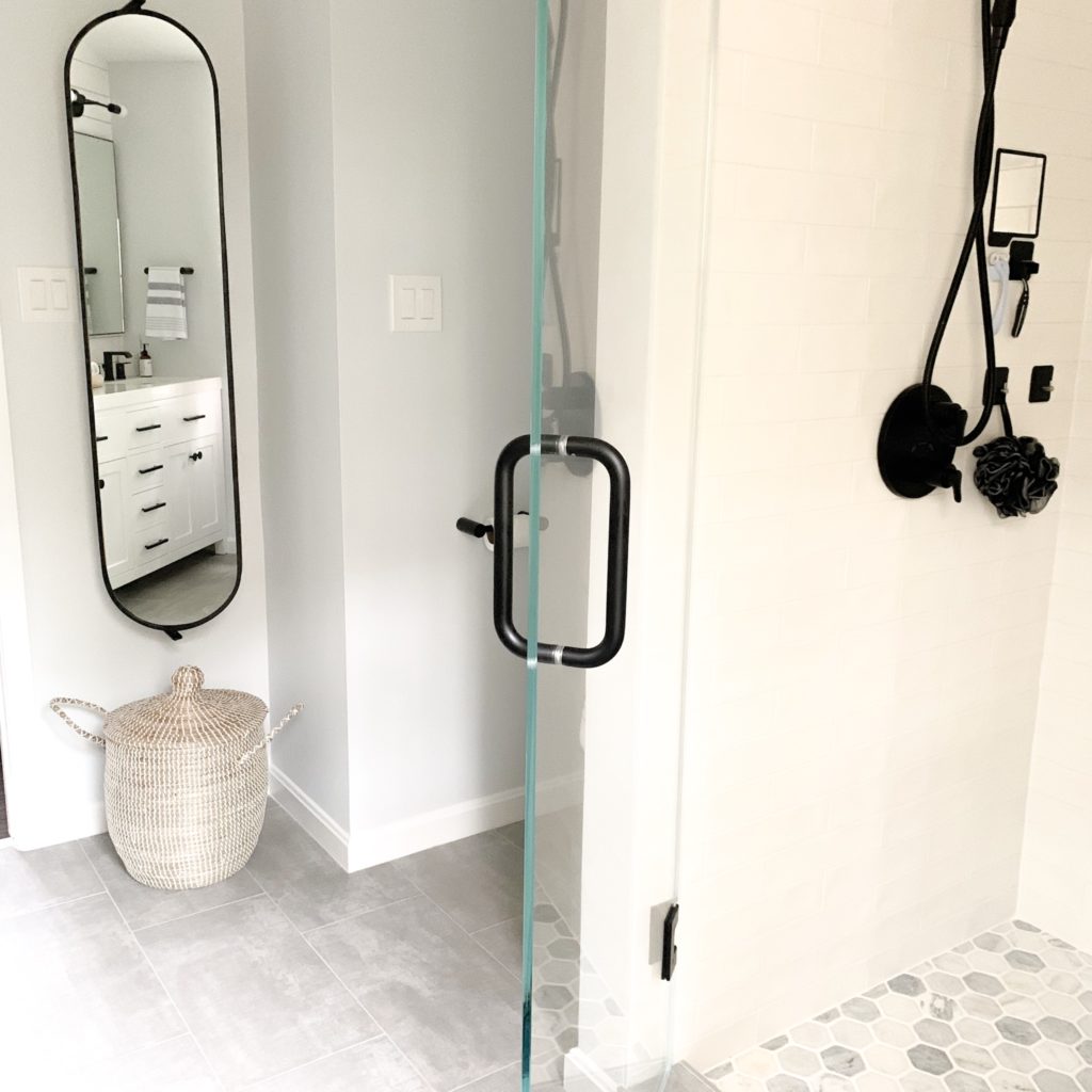
By sticking with predominantly white and grey, we knew we needed an accent. We LOVED the look of matte black fixtures, especially popping off a white background. It gave the perfect modern twist to the farmhouse elements…. the white shiplap, subway tile, and cement floor.
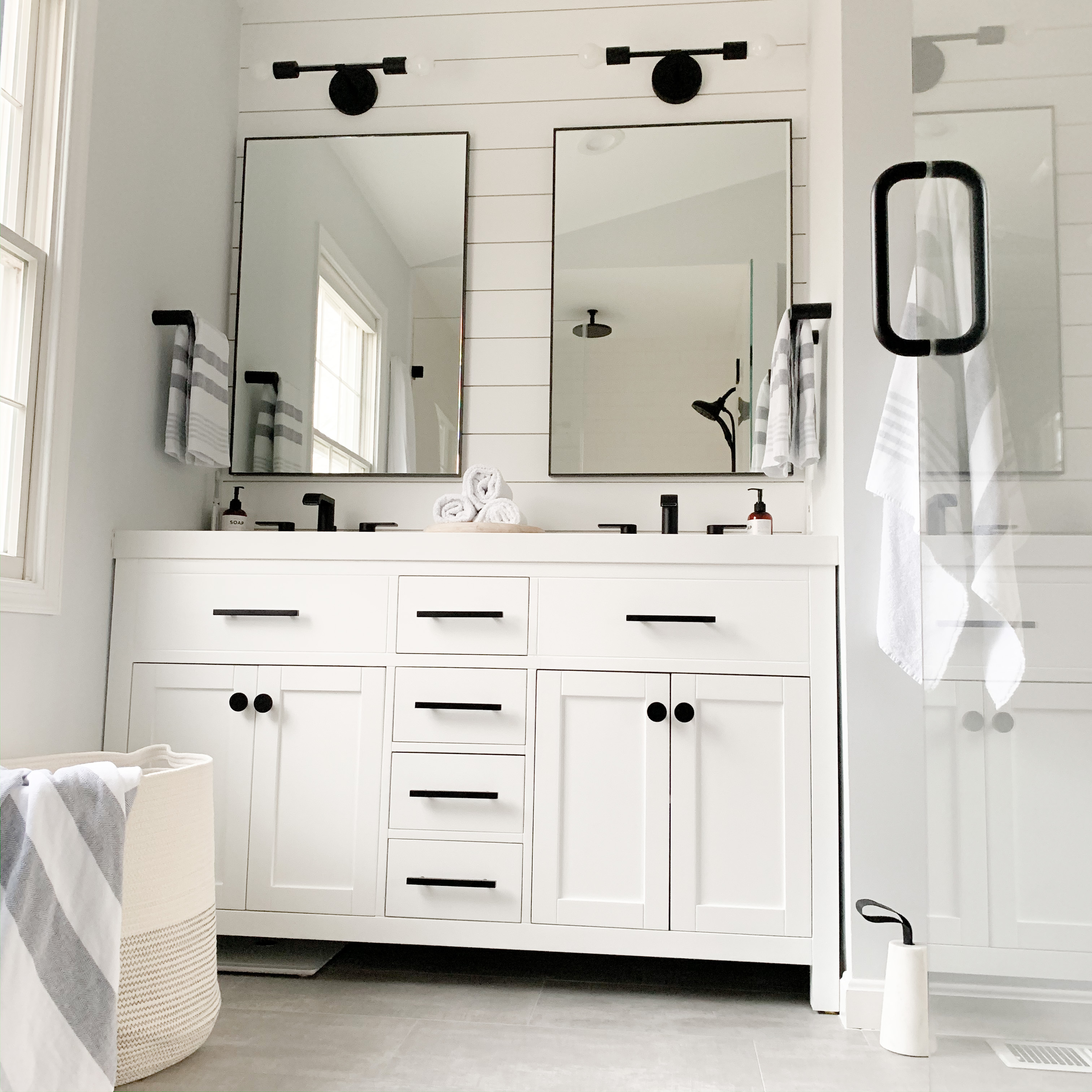
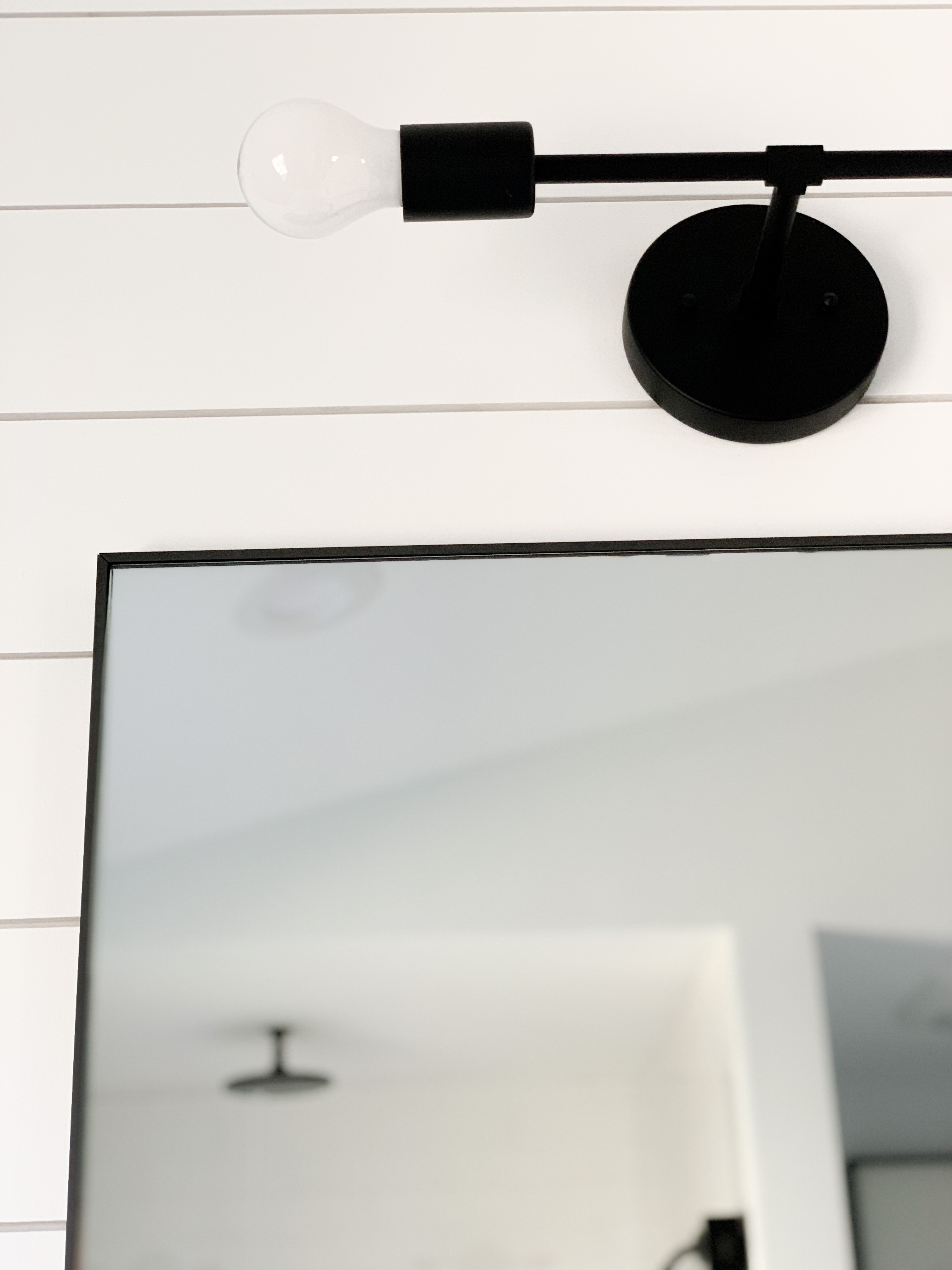
We started with these gorgeous infinite mirrors from CB2. The name totally fits and makes the space feel so much bigger. We chose a modern sconce to go above, and love the exposed bulbs.
The faucets were SO hard to find at a reasonable price. I thought we were going to have to suck it up and pay almost $400 per faucet. Then the clouds parted and a light shone down on a Home Depot option that miraculously had come back into stock…. ahhhh!! These Moen Genta faucets have been awesome, and they were just over $150. That doesn’t sound like a huge difference, but saving $500 is no small feat… It allowed us to add the rain shower head into the mix. If I’m being completely honest, we rarely use the rain shower head, but how cool?!
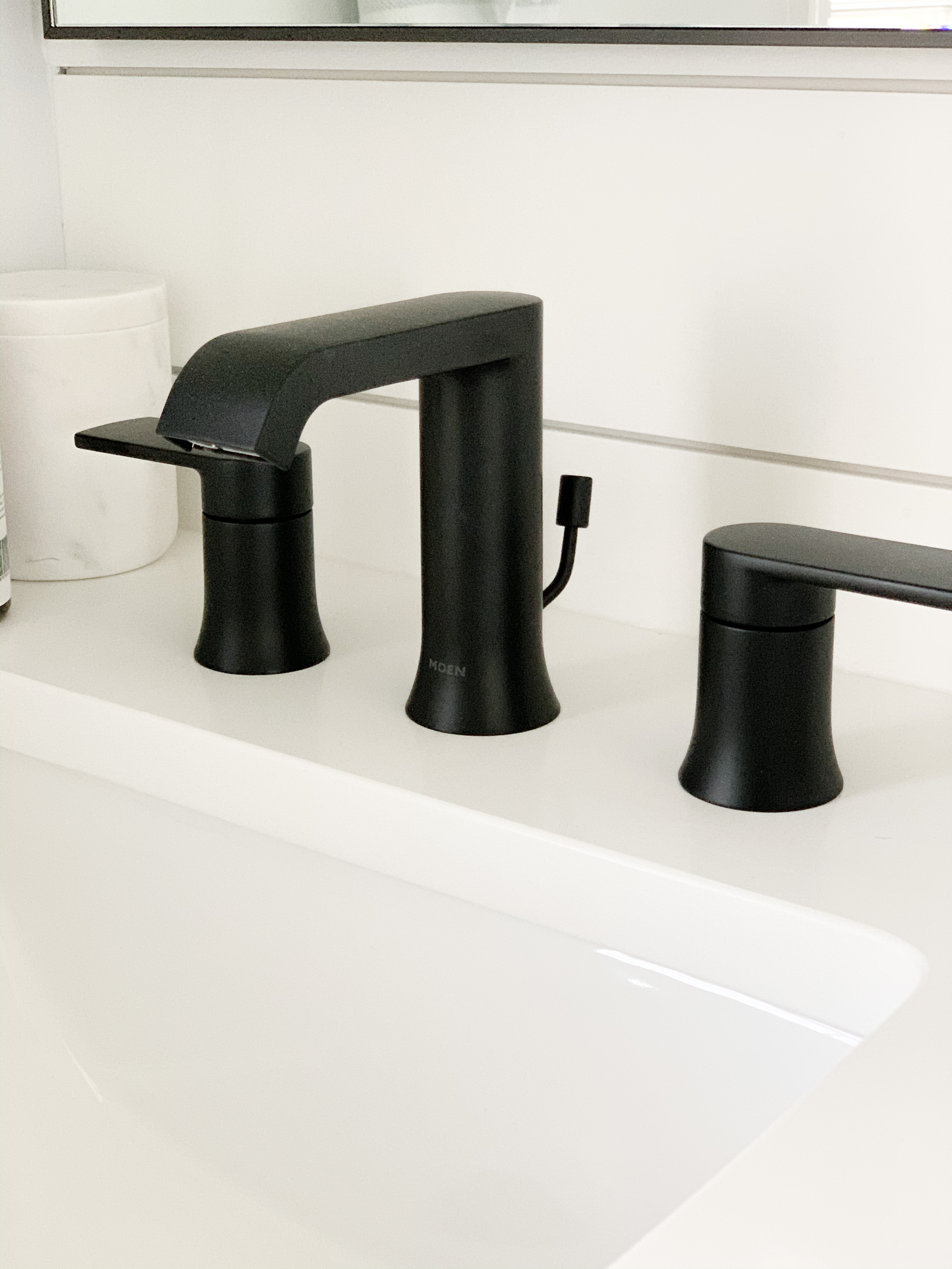
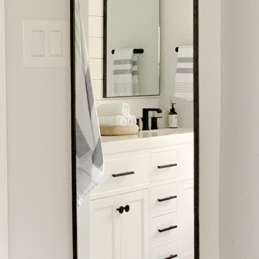
For the shower head, we went practical. I know that the “cord” that comes along with a removable shower head isn’t attractive. This shower head is really the only removable, matte black option we could find. It’s not what I would’ve chosen if I was going purely for aesthetic. However, how do you clean a shower if you don’t have a removable shower head? I will never know.
.
Accessories!
You would think that accessorizing would be the quick part, since it’s not a permanent fixture. For me, it still took forever! We wanted to be as excited about every piece going into the bathroom as we were about the whole project. Before the reno, we had been using the same towels we had gotten at our wedding. We didn’t want to get rid of them for sentimental reasons, but they clearly didn’t match. In the kids’ bath, we went with $12 towels, but we wanted something a little more “fancy” for ours. We went to Serena and Lily and fell in love with this towel set. Again, just the perfect mix of modern and farmhouse!
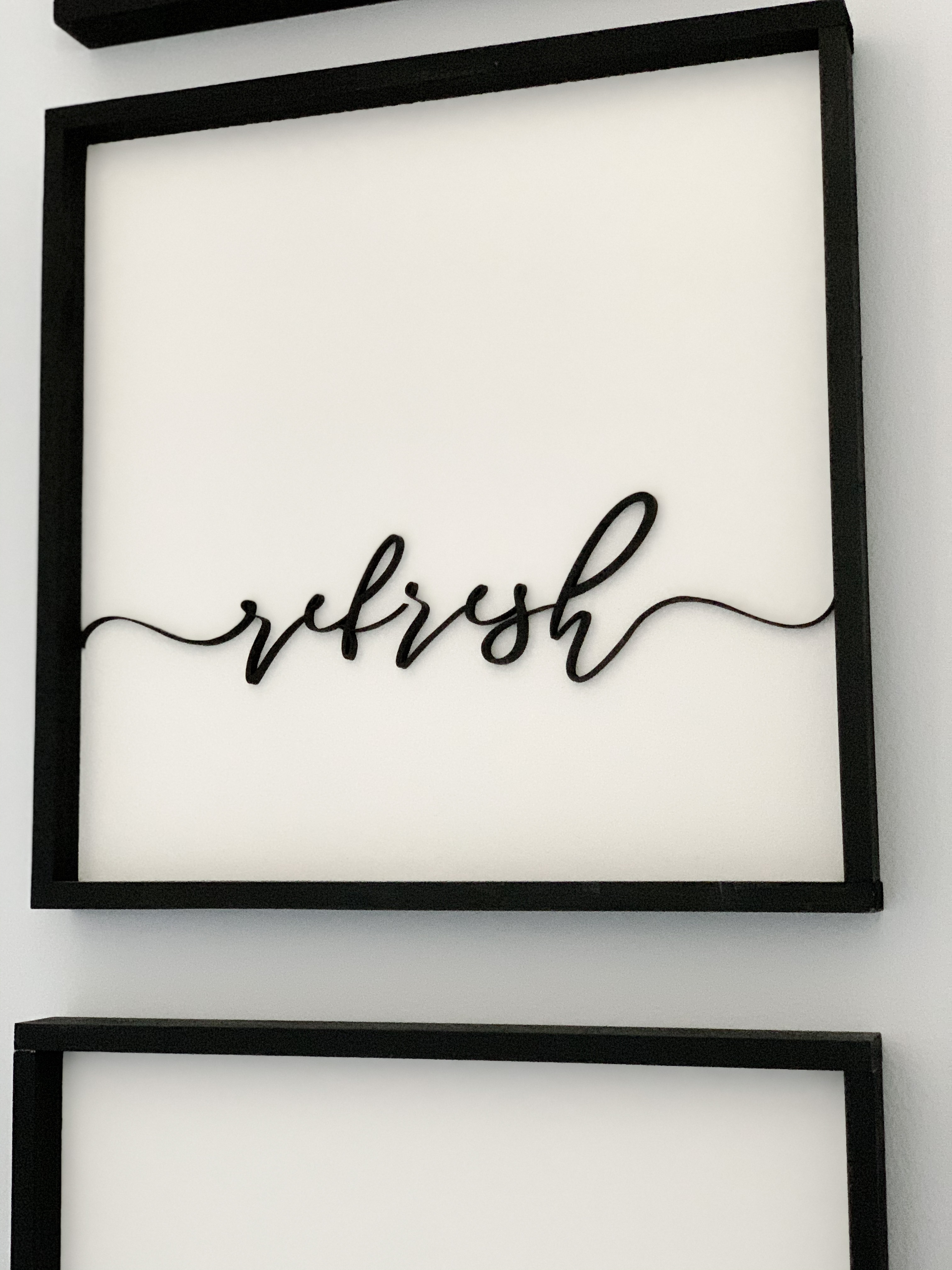
We went with amber bottles/black tops for all soaps and shampoos. We wanted to incorporate more natural wood pieces, but we’re still on the hunt. We had the awkward toilet “nook” to deal with, so we got these gorgeous custom wood signs done by Method Quality Goods. They make me happy, which is a lot more than I could say for that nook before!
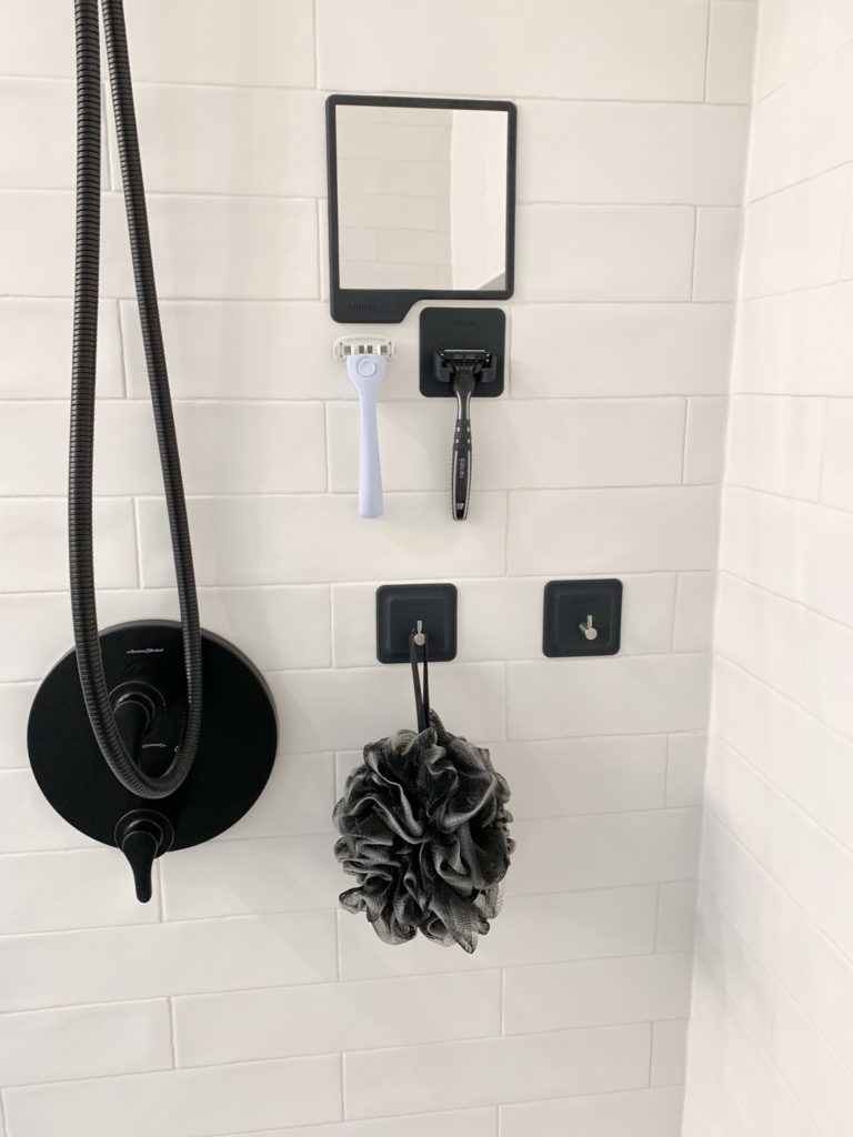
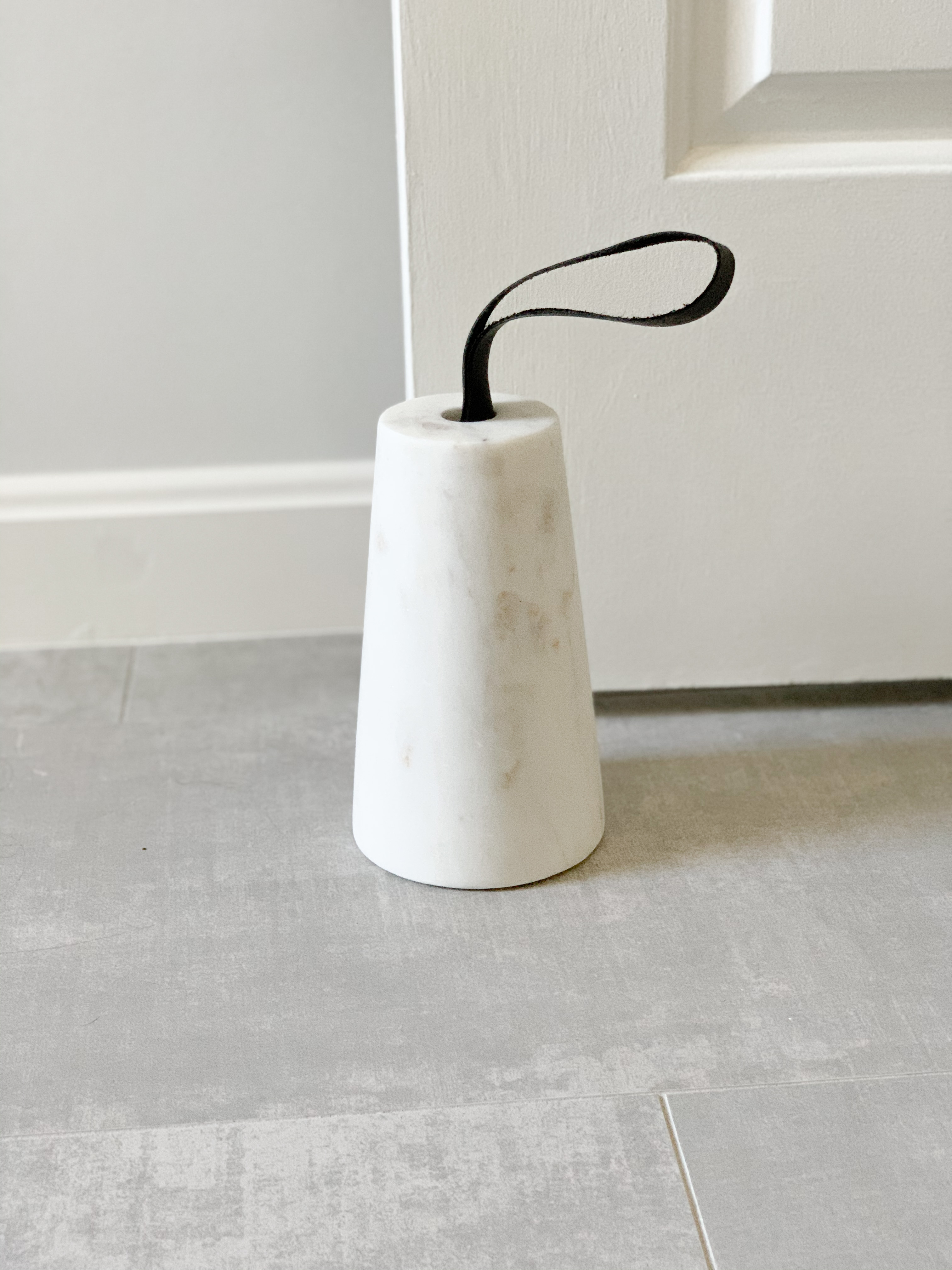
Then, since we had the marble shower floor, we decided to incorporate some marble accessories from CB2… this doorstop, this marble trash can, and these canisters. And inside the shower, we keep it organized with items from Tooletries. It was such a random find, but I’m seriously in love with the shower hooks and holders!!
Wow, that was A LOT of information! No wonder it took me a year to take the time to write this!
.
.
Some of the links contained in this post are affiliate links. Please read the Disclosure Policy, linked here.
